
Is your website design looking a little worse for wear?
Has your mobile app not been redesigned since you launched it back all those years ago?
Do your customers roll their eyes and mutter a four-letter word when you ask them to use your online payments system?
If the answer to any of these questions is yes, it’s probably a good time to revisit your online user interface.
Your website’s look is critical, as 94% of all visitors base their first impressions of a website on its design.
This is where great UI, or user interface, comes into its own. Let’s look at what user interface is, and how you can use it to build a site your customers love.
But first… What on earth is user interface?
What is user interface (UI)?
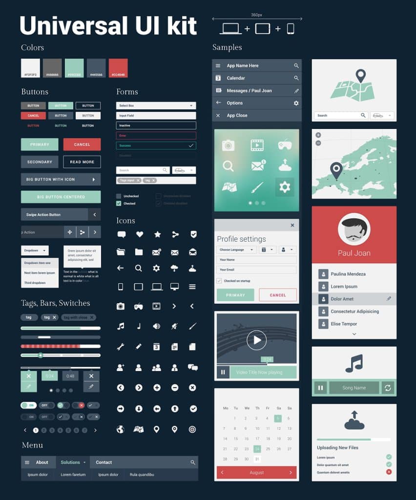
UI is the process of altering the design of a website, app or digital product, so people are more likely to interact with it.
By design, I mean anything from the images and photos used, all the way through to typography and colour combinations.
Is UX the same as UI?
Many people think you can use the terms UI and UX (user experience) interchangeably, but this is not the case.
While UI is preoccupied with reviewing a digital product’s aesthetics, UX is more concerned with the journey customers take to complete a transaction and how it can be improved.
The two concepts do go hand-in-hand though… you don’t want a website that looks great but is absolutely awful to use!
With this in mind, here are five ways you can review and amend the user interface of your website or app.
Sometimes simple ideas are the best ones
If you want to improve your UI, you don’t have to redevelop your whole website.
Even changing the font or the shape of the buttons can have a significant impact on conversions.
Here’s an example of a great UI move that was a straightforward one.
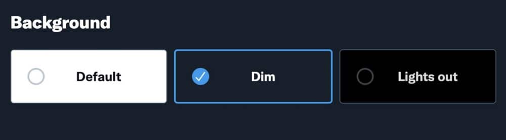
Twitter (now known as ‘X’) introduced ‘night mode’ across its website and app in 2016.
It was exactly the same as the original; it just used a black colour palette instead of a white one.
People loved the change and as a result, ‘night mode’ found its way onto a variety of different apps including Slack, WhatsApp, Facebook, and Gmail.
In fact, 95% of people prefer dark mode over light mode!
White space is your friend
It may be tempting to cram lots of visual elements into your website, cross your fingers and hope for the best.
However, having a little bit of blank space can be a good thing when you are redesigning your website.
White space (also known as negative space) is the empty space between design elements.
People like white space because it’s pleasing to the eye. It can also can make content easier to read and draw the visitor’s eye to key calls to action.
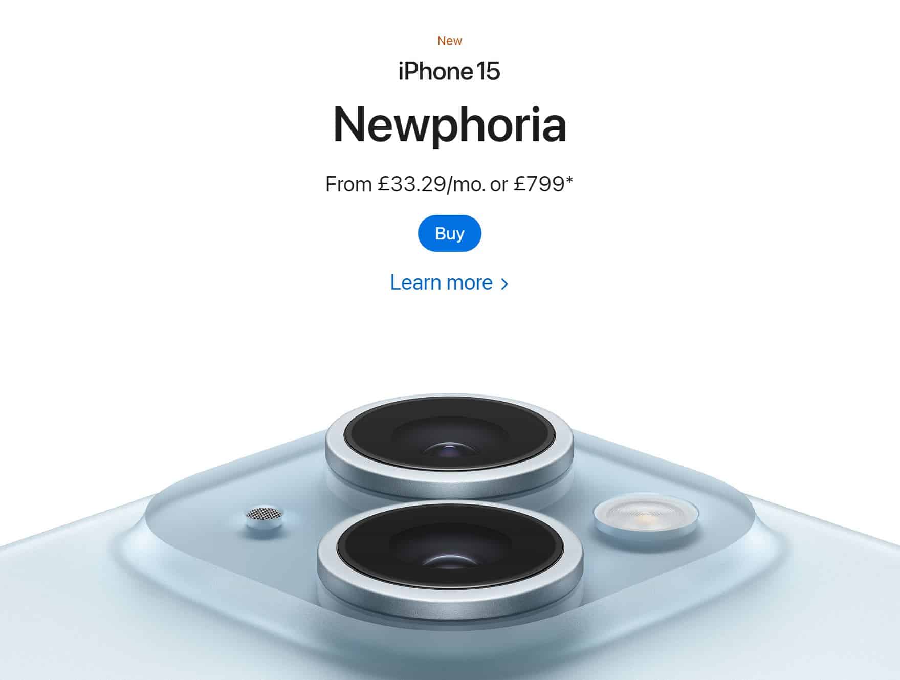
Think of brands like Apple. Apple’s website is intentionally minimalistic, highlighting the brand’s quality instead of relying on bells and whistles to sell products.
When you redevelop your web pages – take white space into account. Don’t stuff key features too close to one another and always ask if page components are 100% critical.
If they’re not, take them out.
Don’t be afraid to try something different
You may think you’re bound by certain things when considering the UI for your website or app.
This is especially true if you’re in a more ‘serious’ industry like finance, insurance, or healthcare.
However, there are things you can still do to inject personality and fun into your online design.
For example, take the colour in your logo and use the opposite one on the colour wheel.
Got a blue logo? Use pops of orange to add striking accents to your pages. Red logo? Do the same but with flashes of green.
If you use a particular font style and size in your usual branding, try using a different style to highlight critical information.

For example, if you usually use a serif font, use a sans-serif one instead. This doesn’t just look aesthetically pleasing, but is great for getting attention.
Show, don’t tell
Stats on websites are great – they add credibility and social proof that can help visitors to convert. However, walls and walls of statistics can be mind-numbingly dull.
People aren’t neccesarily going to stick around to find the data they need, so you need to provide web visitors with information quickly as you can.
You can make your website look more appealing by replacing text with visual content.
Photos, graphs, infographics, animations, and videos are fantastic ways to highlight your key information in an engaging way.
(Although of course, make sure that any imagery or videos you use are accessible. For example, by using alt text on images.)
Test, test and test again
The key thing with user interface is to regularly test amends to see if they have led to positive results for your business.
Implement a change to your website, wait a short while and see if it has led to increased purchases, visits or leads. If it has, great! If not, give something else a try and repeat the process.
UI works best when there are lots of small changes taking place frequently rather than large infrequent ones.
If you have processes in place for A/B testing, use them.
This means you can serve your updated web page to some visitors and your old web page to others and see which performs the best.
In conclusion: it’s not vain to think about how your website looks!
It’s important to make sure your website loads quickly and provides a great experience to users.
But it’s equally important to make sure it looks good and showcases your brand.
The great news is that it’s possible to have the best of both worlds.
Yes, you don’t have to choose between style and substance!