
A little while ago I created an article that reviewed some of the best 404 pages from a wide range of businesses across the globe.
The article did so well that I decided to create a sequel!
When you run a software-as-a-service (SaaS) business, it’s vital to have a 404 page that not only helps customers navigate their way around your website, but also shows off your brand identity.
Need some inspo? Join me as I take a look at some SaaS 404 pages, reviewing the best (and worst!) ones out there!
In this article I’ll share my thoughts, and give each 404 page a mark out of five for:
- Coolness. How fresh and funky the 404 page is
- Creativity. How innovative and clever the 404 page is
- Functionality. How good the 404 page is at getting you to the pages you want to access
App Sumo
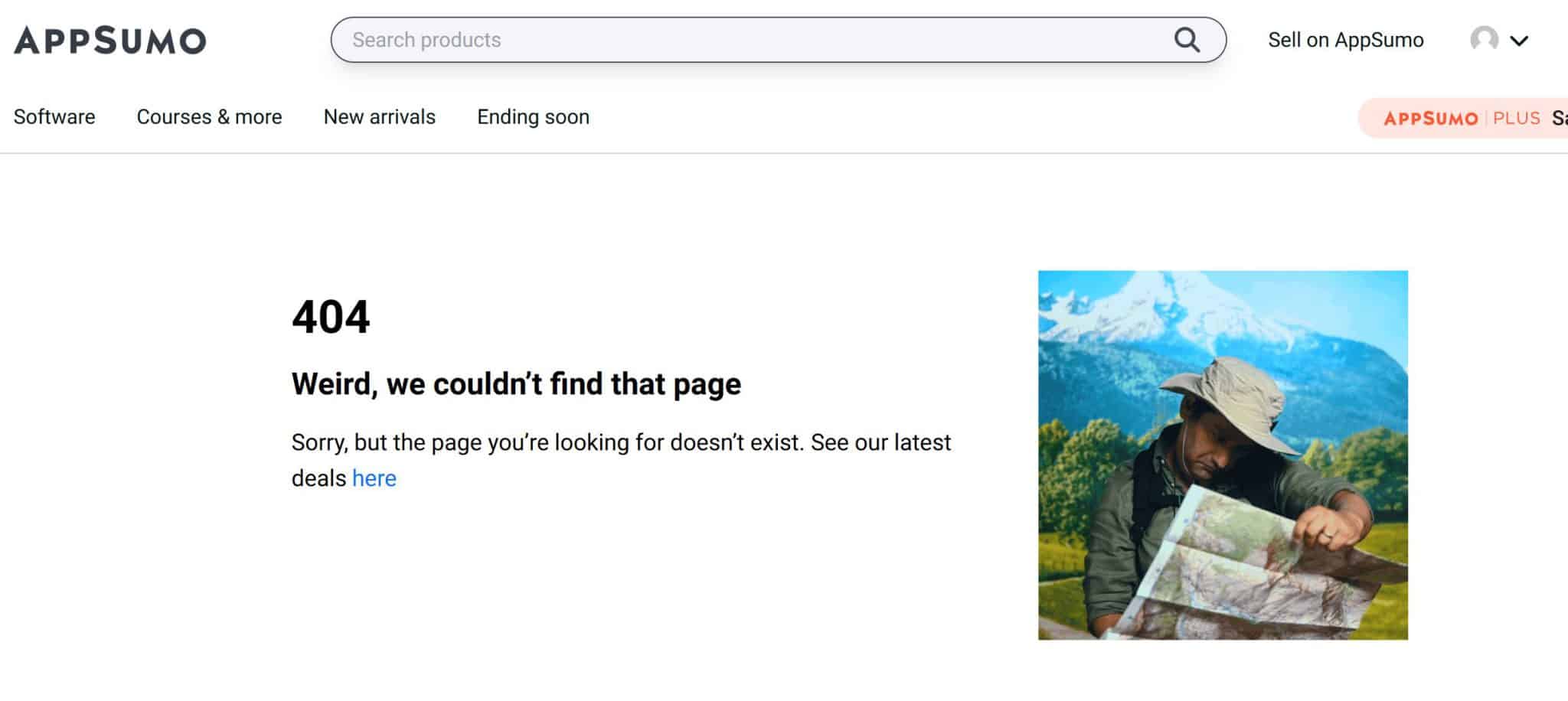
App Sumo is known for being a quirky, informal brand, so it’s great that it injects some personality into its 404 page.
‘Sorry, we couldn’t find that page’ and ‘weird, we couldn’t find that page’ – a one-word substitution that results in a totally different feel and vibe.
It’s not obvious from the screenshot, but the man looking at the map is actually a GIF, which adds excitement and dynamism and encourages visitors to stick around.
Coolness: 3/5
Creativity: 4/5
Functionality: 3/5
Crunchbase
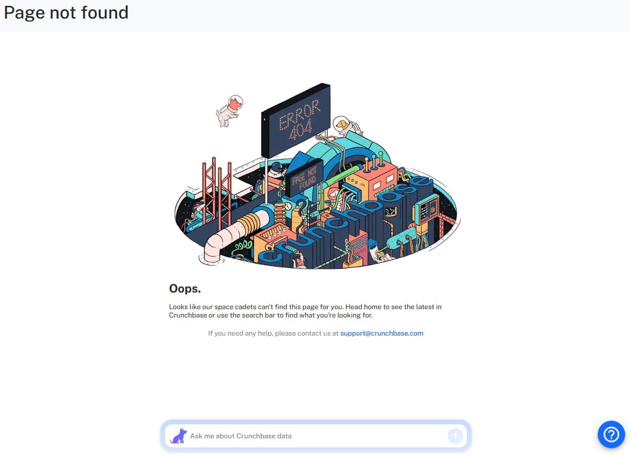
I like a themed 404 page where the image matches the copy. Crunchbase has gone for an extra-terrestrial theme on its 404 page, with mentions of ‘space cadets’ and an adorable image of dogs floating around in spacesuits.
Plus, there’s a search bar and an email address if you have any questions about broken links. A good, solid showing.
Coolness: 5/5
Creativity: 4/5
Functionality: 4/5
Groove
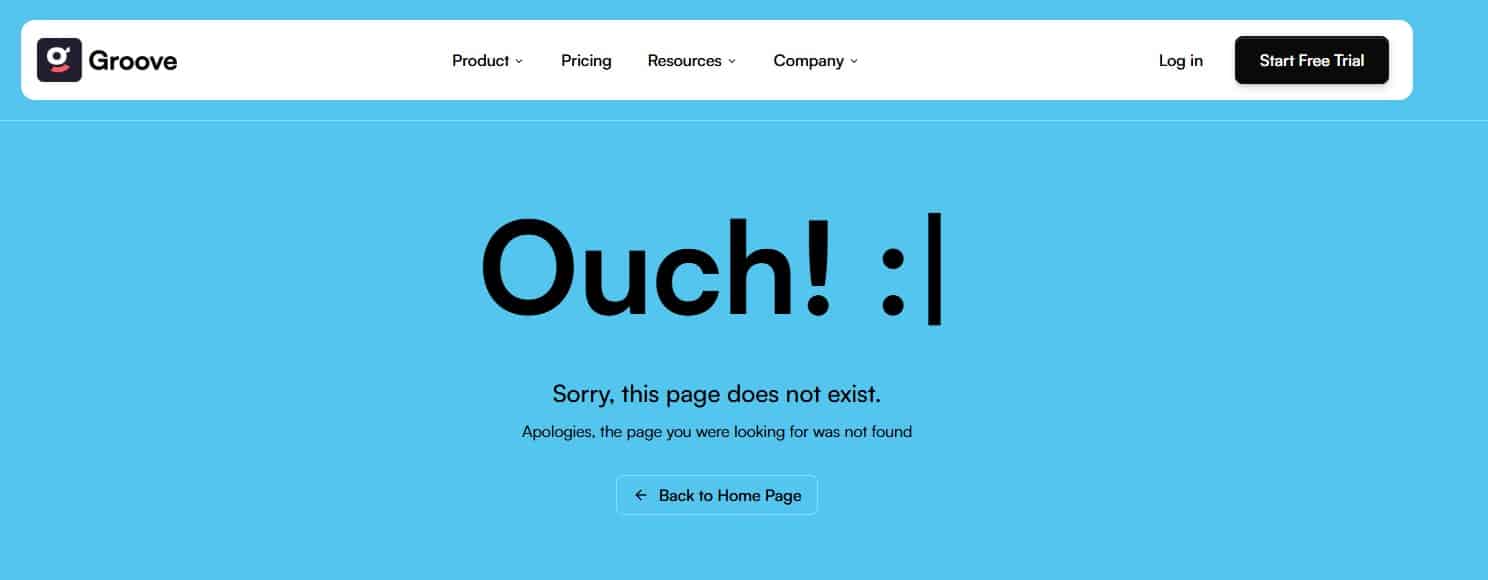
This is a simple 404 page for sure, but it has a dirty Y2K vibe to it, which I’m digging.
I like the electric blue background (not many 404 pages have a coloured background, but it’s a great idea as it gets your attention) and the smiley adds a funny little touch.
The wording is a little clunky as it essentially says the same thing twice, but hey, that’s an easy fix.
Coolness: 4/5
Creativity: 3/5
Functionality: 2/5
Hootsuite
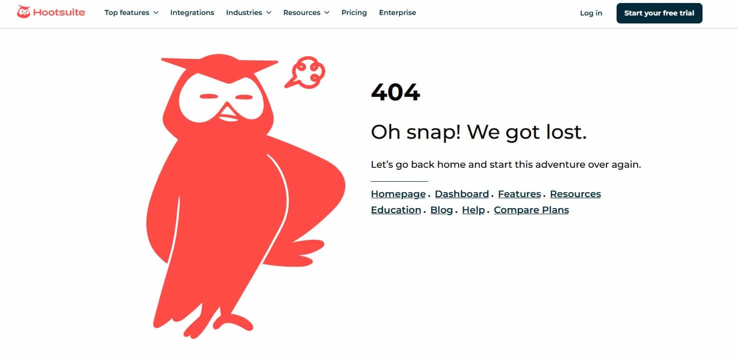
Hootsuite has a reputation for being dynamic and fun, and this 404 page doesn’t disappoint.
I love the frustrated owl, the friendly tone of voice, and the fact that there are links to the most popular pages. Three out of three from me!
Coolness: 4/5
Creativity: 4/5
Functionality: 5/5
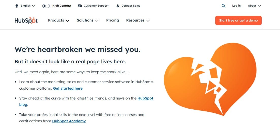
HubSpot
I have a bit of a love-hate relationship with HubSpot.
The brand puts out a lot of useful content for sure.
However I’ll never forget the time I accidentally put my personal mobile number on a lead capture form and got two phone calls from two overly-eager sales reps twenty minutes afterwards.
I’m definitely a lot more careful sharing personal info online now!
Like Hootsuite though, this 404 page doesn’t let me down. It’s friendly, funny, uses the brand colours and even signposts users to content they might find of interest.
Coolness: 4/5
Creativity: 4/5
Functionality: 5/5

Okay, LinkedIn isn’t a SaaS platform as such, but I’m including it here anyway!
I’m on here a lot because of work, so I see this 404 page more than I would like.
Needless to say, it does the job. It’s branded well (I like the telescope) and the copy is helpful, guiding the viewer either back to the previous page, their newsfeed, or LinkedIn’s help pages.
There are better SaaS 404 pages out there, but there are worse ones too.
Coolness: 3/5
Creativity: 3/5
Functionality: 3/5
Mailchimp
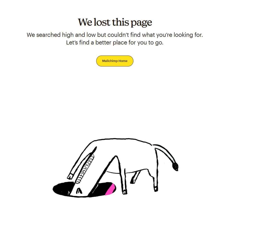
I don’t know what a horse looking down a hole has to do with broken links, but I love it (and the image is animated too!)
The copy is friendly and fun, and the call-to-action is bright and bold. Could do with some more links if I’m being picky, but still good stuff.
Coolness: 5/5
Creativity: 3/5
Functionality: 2/5
Product Hunt
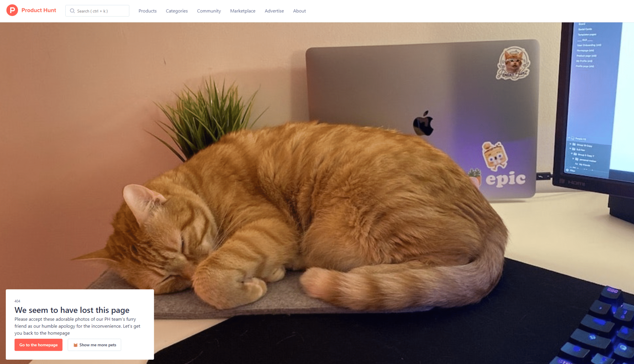
This 404 page is great for two reasons. Firstly, the apology message is funny and on point.
Secondly… do I have to spell it out… Cute photos of the Product Hunt team’s pets!
(And yes, if you click on the white button, it shows you more pets!)
As always, more links and/or a search bar would be nice. But adorable animal photos always win out.
Coolness: 5/5
Creativity: 4/5
Functionality: 3/5
Semrush
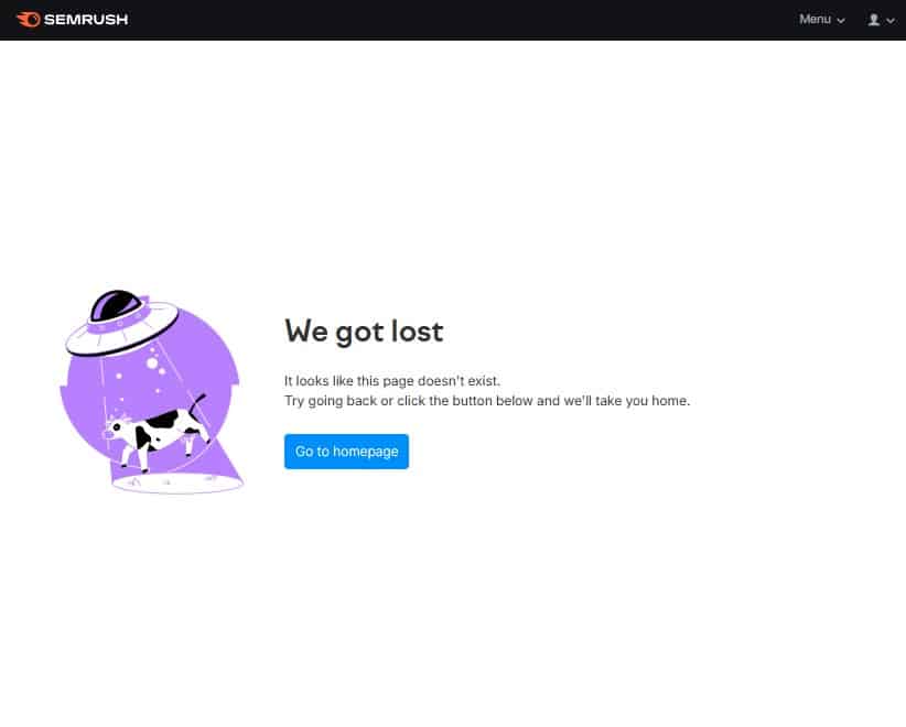
Semrush continues the trend of SaaS platforms having quirky and fun 404 pages.
The text and accompanying image are cute and work well together.
Like Mailchimp, the navigation options are a little sparse, but perhaps when you have so many different features, it’s an intentional choice to keep things light so you don’t confuse customers.
Coolness: 5/5
Creativity: 3/5
Functionality: 2/5
Shopify

This effort from Shopify is dull all over. The message, the imagery, even the background, is grey and uninspiring. Plus, the only option is to go back to the homepage.
Shopify is such a great brand with a big, engaging personality, so this feels like a big letdown.
Coolness: 1/5
Creativity: 2/5
Functionality: 2/5
Squarespace
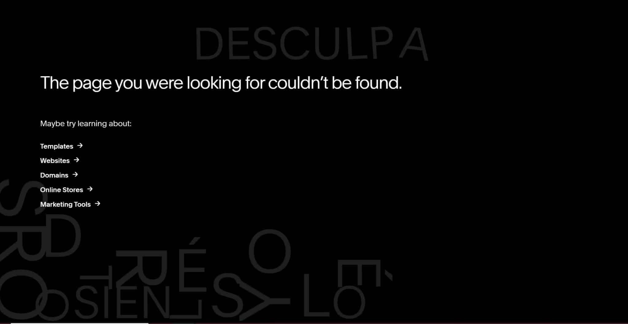
Like the App Sumo page I showed you earlier, Squarespace’s 404 page is one you need to see in real time.
While you’re on the page, words meaning ‘sorry’ in different languages fall down to the bottom of the page. You can hover over the words and letters to bat them around the screen.
First time I was on this page, I spent about ten minutes just messing around!
Yes, the page itself is a little basic and the wording leaves a lot to be desired. But out of all the SaaS 404 pages in this article, it’s one of the most fun!
Coolness: 4/5
Creativity: 5/5
Functionality: 2/5
Typeform
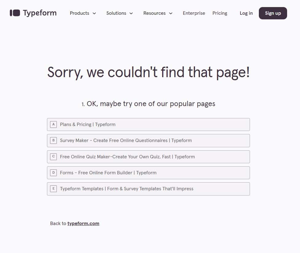
It’s definitely a testament to your brand identity when you have a good idea of what a 404 page is going to look like before you click on it.
When I visited Typeform’s site I thought to myself, ‘wouldn’t it be funny if the 404 page was like one of its forms?’ and lo and behold, it was!
This is a good 404 page. It’s not the showiest, but it works well on mobile, is on brand, and links out to all the relevant pages.
Coolness: 3/5
Creativity: 4/5
Functionality: 5/5
So there you have it – which SaaS 404 page is your favourite?
Don’t forget, if you need help creating vibrant, informative copy for your SaaS brand, just click the button below!