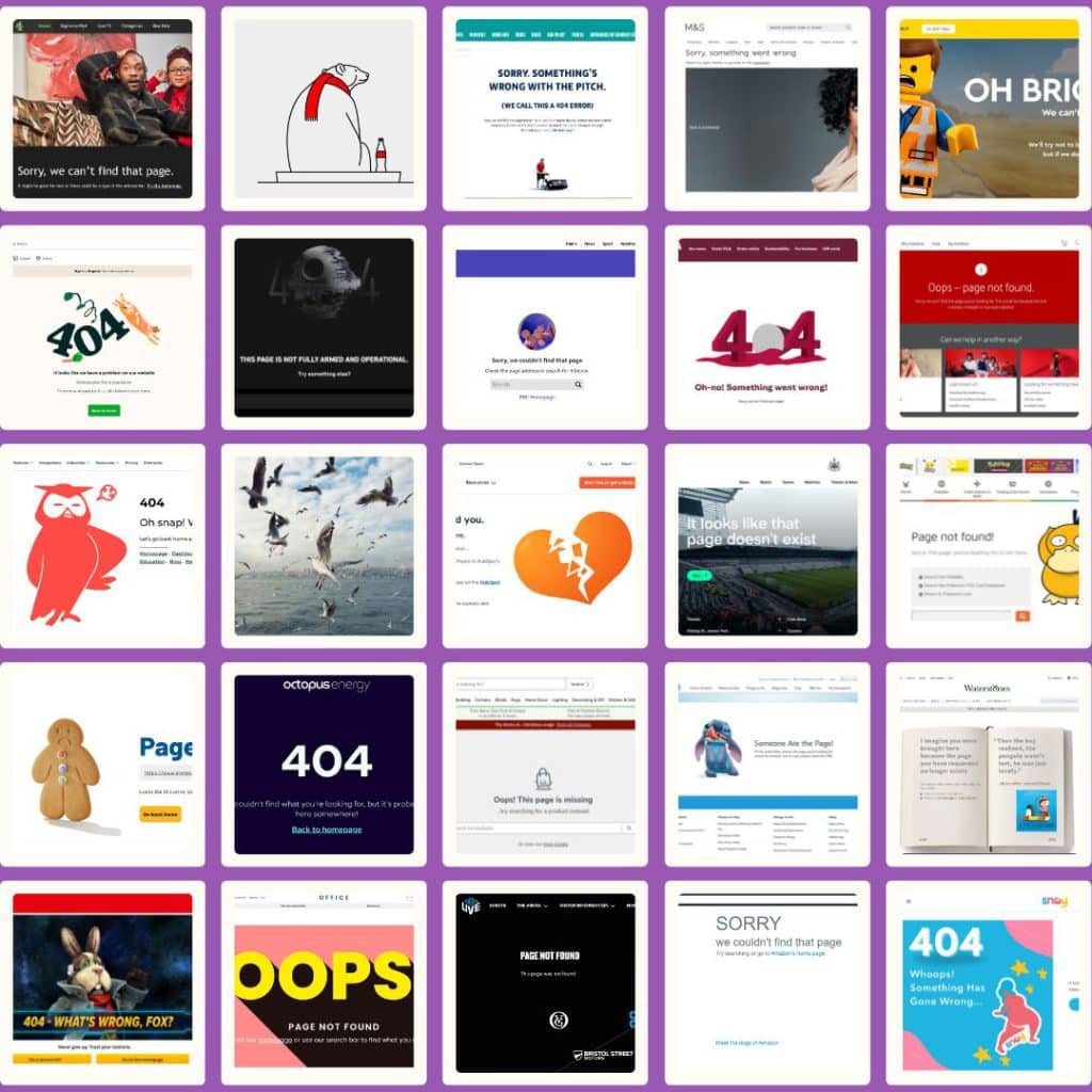
Want inspiration for your company’s 404 page? Join me as I look at the coolest and most creative 404 pages around!
The internet is growing and evolving all the time. As a result, pages get deleted, renamed, or just moved around.
When you spring clean your website, a 404 page can help keep visitors on your site and encourage them to visit other pages.
However, it’s essential that your 404 page is eye-catching, on-brand, and entertaining.
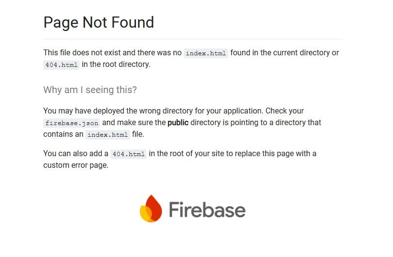
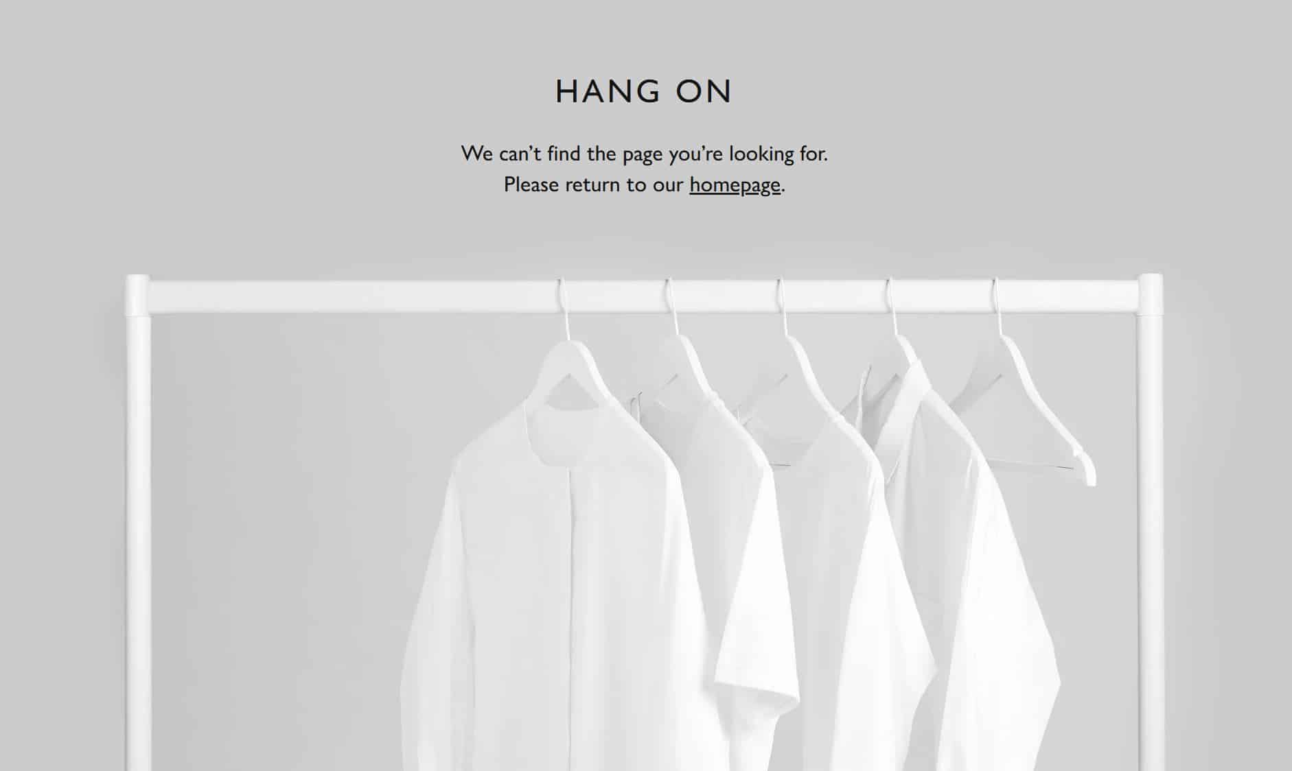
Offer something that looks like this…
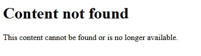
… and prospective customers won’t stay on your website for long.
I decided to do some online sleuthing to sniff out some 404 pages businesses use on their sites.
In this article I’ll share my thoughts, as well as give each 404 page a mark out of five for:
- Coolness. How fresh and funky the 404 page is
- Creativity. How innovative and clever the 404 page is
- Functionality. How good the 404 page is at getting you to the pages you want to access
I’ll keep adding to this article as I find new 404 pages, so be sure to keep coming back!
p.s. Want to see some more awesome 404 pages? Check out this article where I review the best SaaS 404 pages!
Aldi
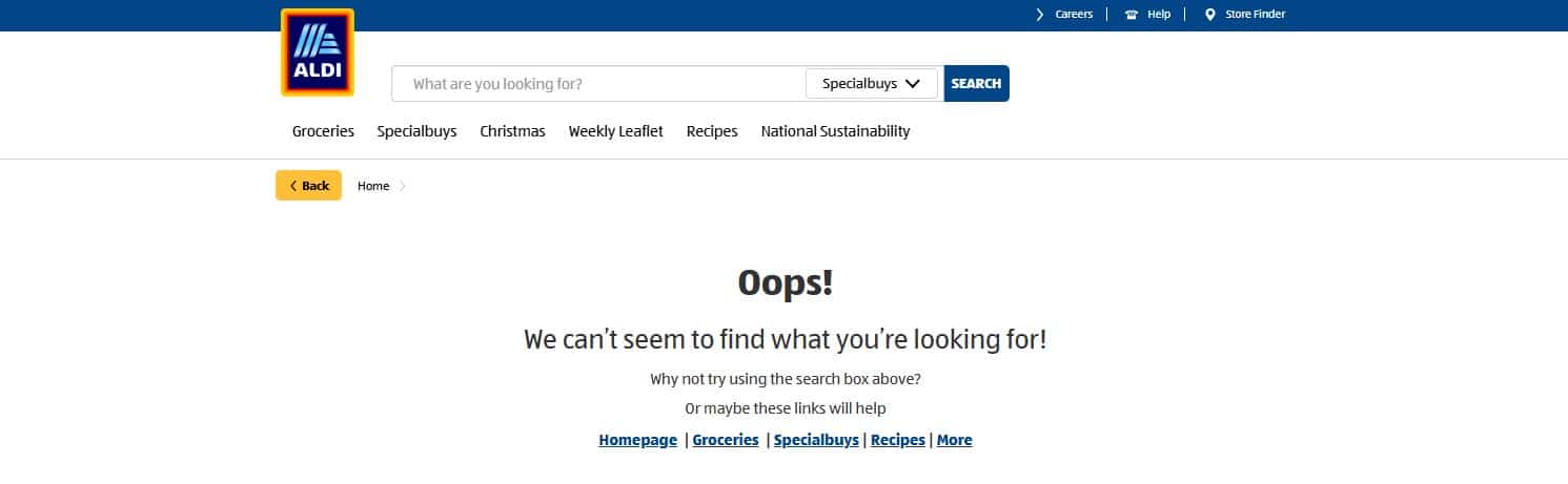
Given that Aldi is well-known for funny and exciting content on social media, I was expecting a little more from this 404 page. Perhaps a cheeky Cuthbert the Caterpillar or Kevin the Carrot to guide the way.
However, it does the job. It clearly states that the page can’t be found and provides lots of links and a search bar so visitors can get themselves back on track.
Coolness: 1/5
Creativity: 1/5
Functionality: 5/5
Amazon
Amazon sells millions of products, so it’s likely that you’ll experience a 404 page at some point in time.
This page is clear and advises visitors to go back to the homepage or search for what they need.
It does the job, but it would have been good to see some links to product categories as well. Amazon will have tonnes of user data it can use to cross-sell items.
Alternatively, visitors can check out the ‘meet the dogs of Amazon’ page, which has lots of cool photos of Amazon employees’ dogs, cats, and other adorable pets.
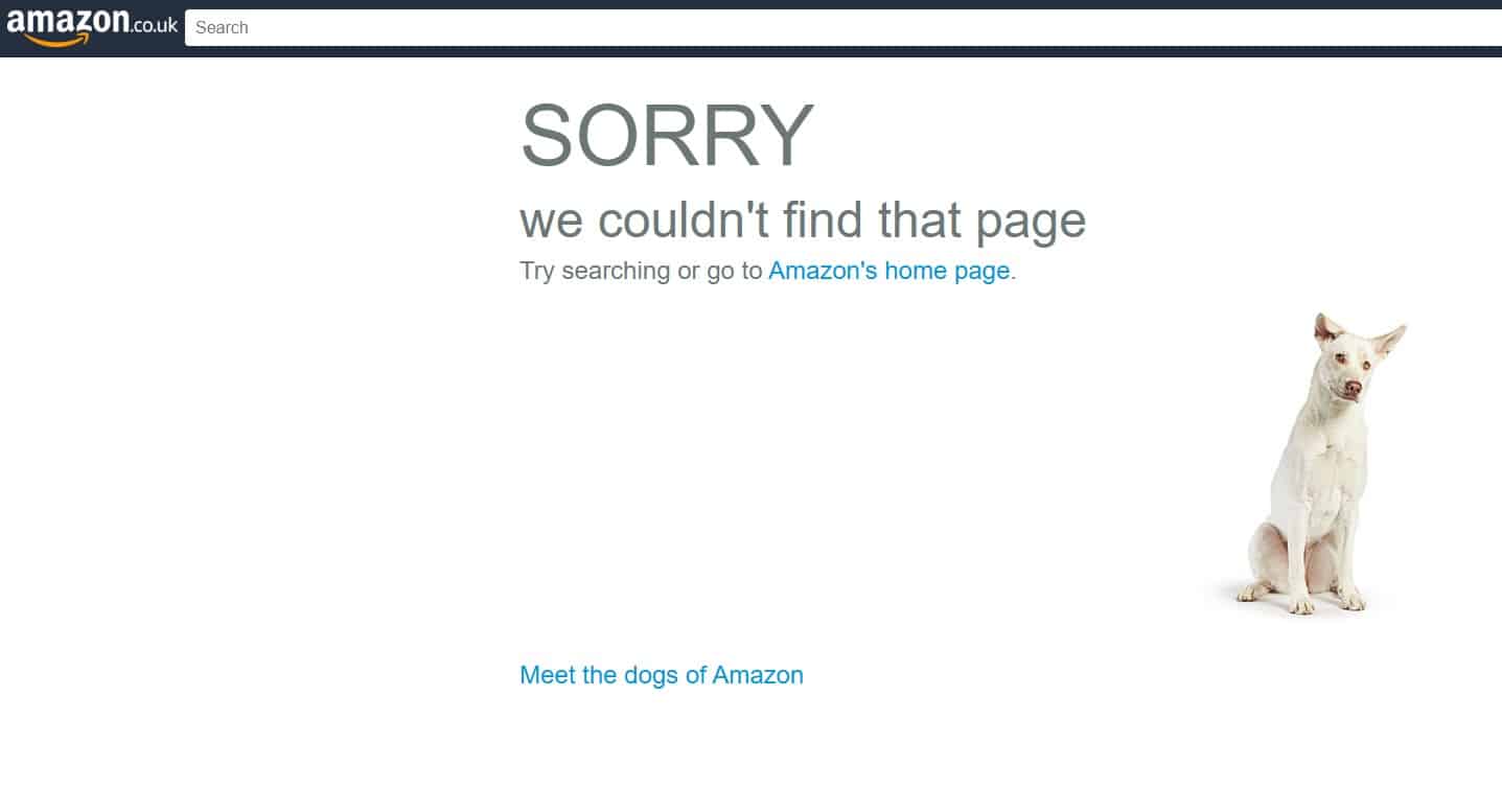
The thing I love most about this 404 page? The dog changes when you refresh the page. I spent about ten minutes spamming the F5 button!
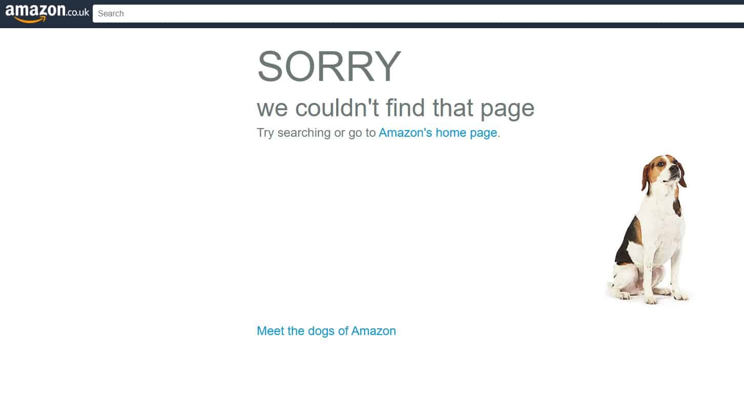
Coolness: 5/5
Creativity: 4/5
Functionality: 3/5
Apple
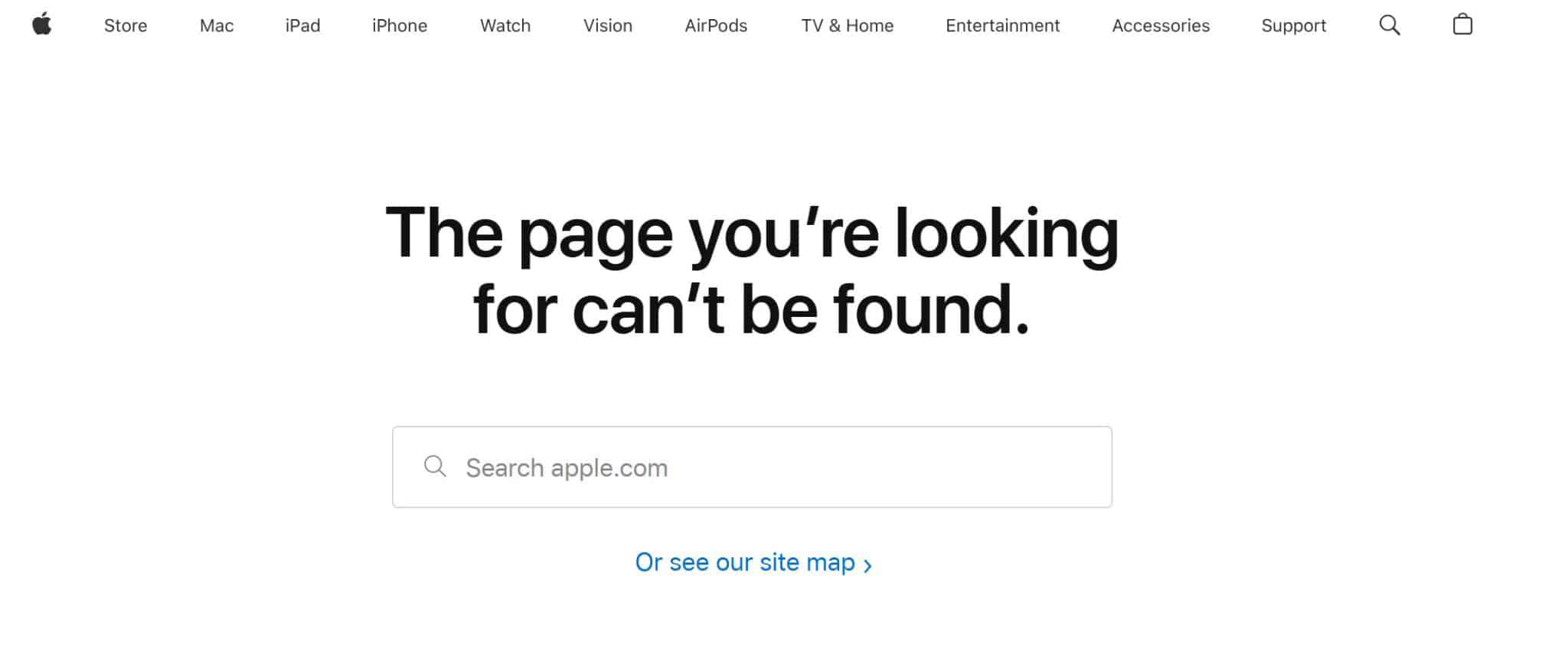
The Apple brand is well-known for its simplicity, so it’s only logical that its 404 page follows suit.
You get a clear message, a search bar, and a link to a site map. Done.
While it would have been nice to see more links, this wouldn’t really fit in with Apple’s minimalist style, so it gets a pass.
Coolness: 2/5
Creativity: 1/5
Functionality: 3/5
Argos

Okay, this page uses the Argos colour and typography well. But it’s bland AF.
Your 404 page is a great way to showcase your brand’s personality. Argos is known for being a fun business that sells a wide range of products, but none of this is evident on this page.
Even some different wording would have worked really well here.
Coolness: 2/5
Creativity: 1/5
Functionality: 1/5
B and Q (DIY.com)
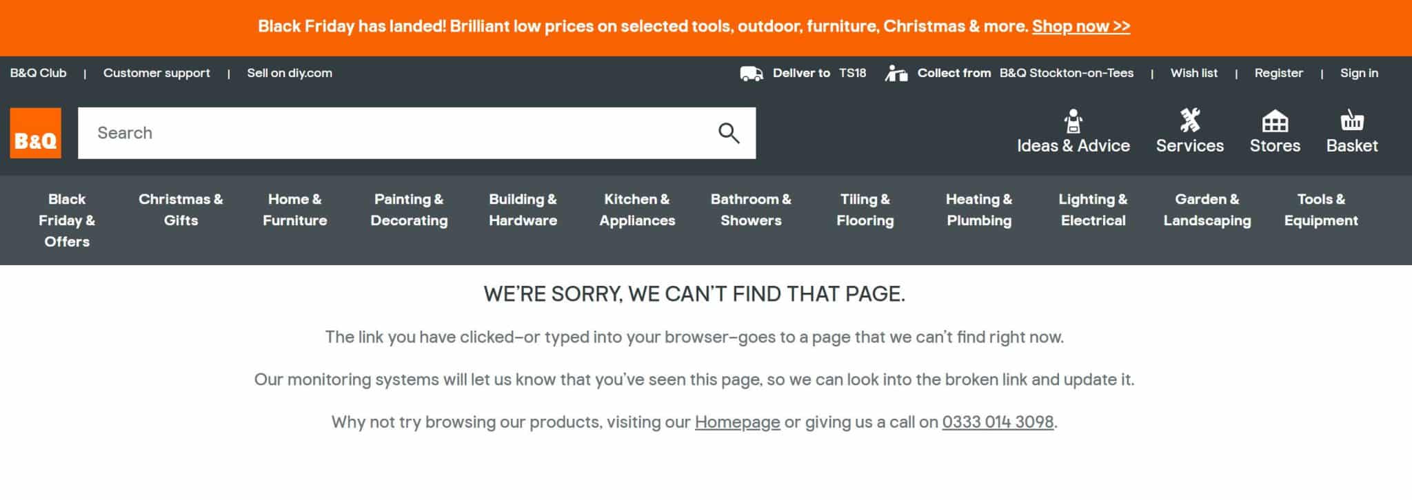
This 404 page isn’t the most exciting, but I included it because it mentions something that a lot of 404 pages neglect to say.
‘Our monitoring systems will let us know that you’ve seen this page, so we can look into the broken link and update it.’
While the wording feels a bit off to me, it’s still a great way to reassure the visitor that B and Q checks for broken links and fixes them.
Coolness: 1/5
Creativity: 2/5
Functionality: 3/5
BBC
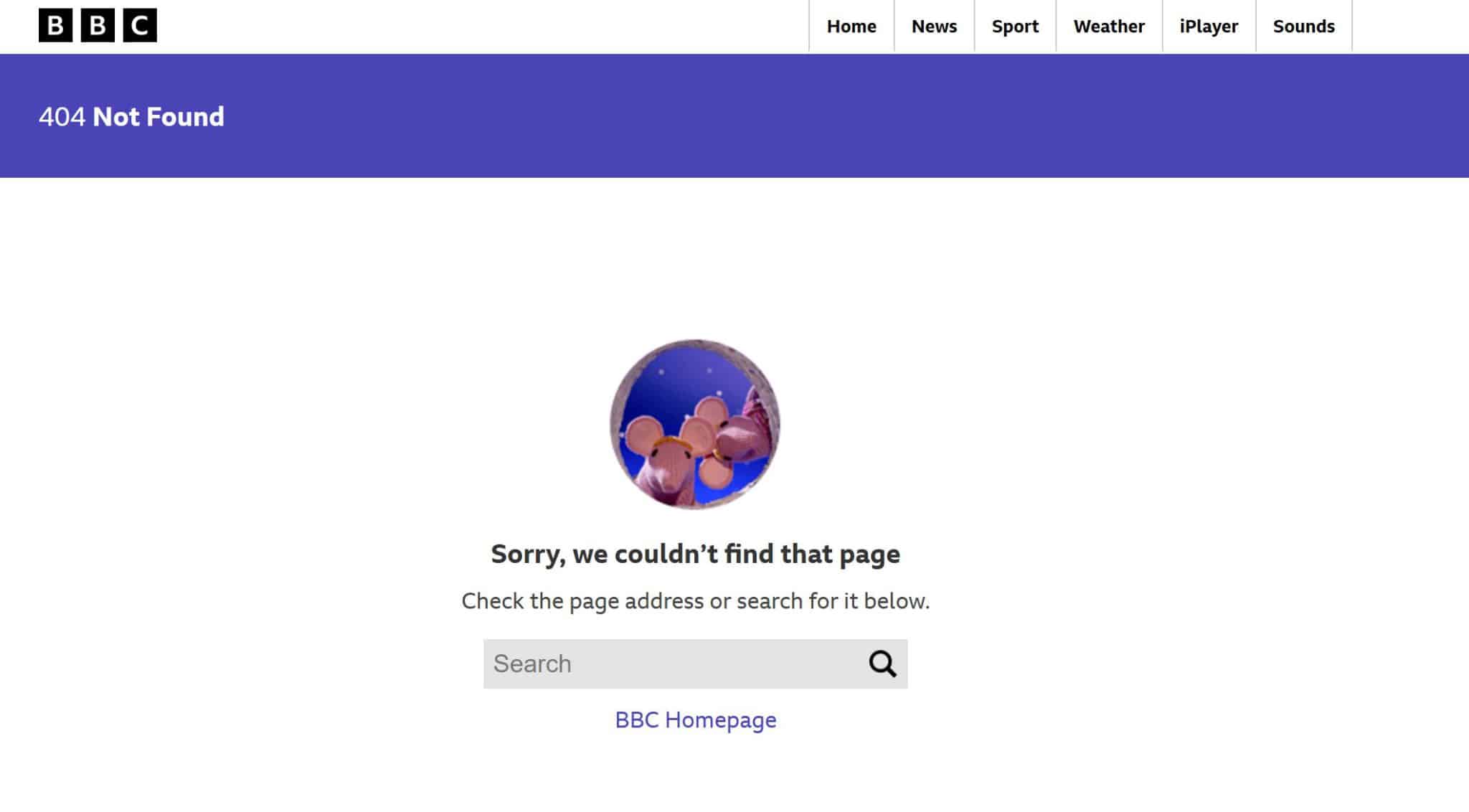
It’s interesting to see that the largest websites have the simplest 404 pages.
This page has a search bar and a link back to the BBC homepage, but I love that there’s a little picture of the Clangers too. It provides a subtle air of friendliness, warmth, and nostalgia.
Coolness: 4/5
Creativity: 2/5
Functionality: 2/5
Bird and Blend
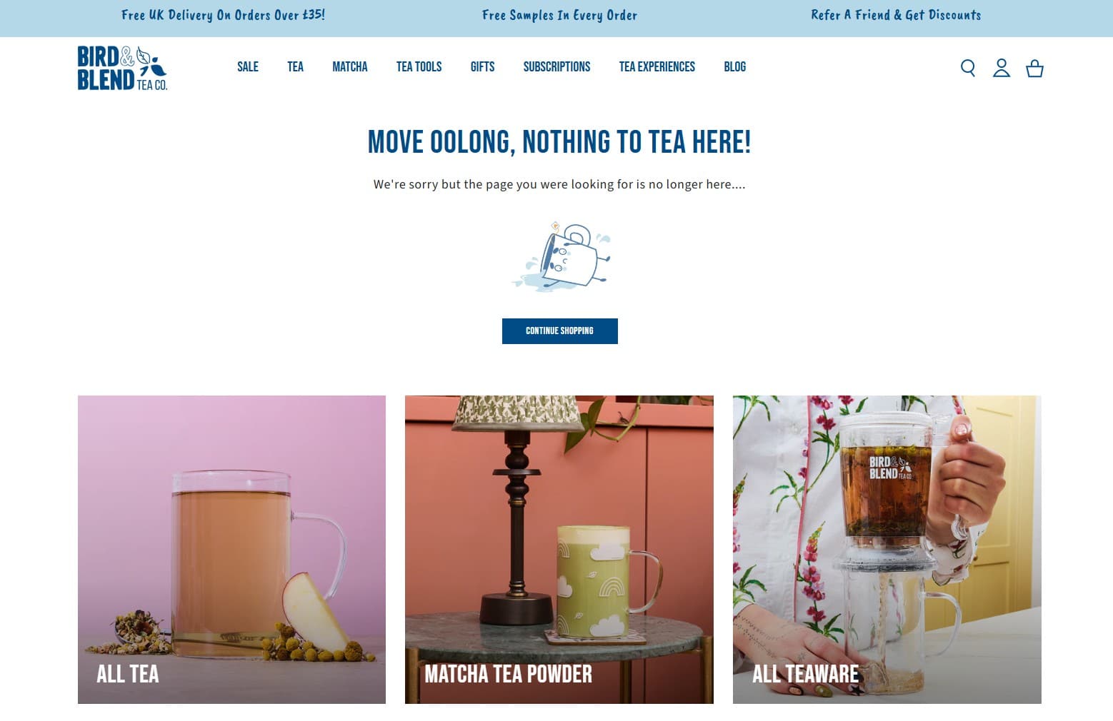
Puns are a bit of a hot topic in the world of UX copywriting. While they can add personality to your 404 page, they may confuse and alienate customers who might not understand them, for example, those who speak English as a second language.
Personally I love a good pun, and I’ll be giving extra marks to businesses that use them, but whether you use them or not really depends on your target audience and how they respond to them.
Anyway, onto Bird and Blend’s 404 page. There are a lot of tea-related jokes, which I love, as well as a funny picture of a sad teacup. From a navigation perspective, there’s a link back to the previous page, and popular page categories. So, this 404 page gets a tick from me!
Coolness: 3/5
Creativity: 4/5
Functionality: 4/5
Boohoo
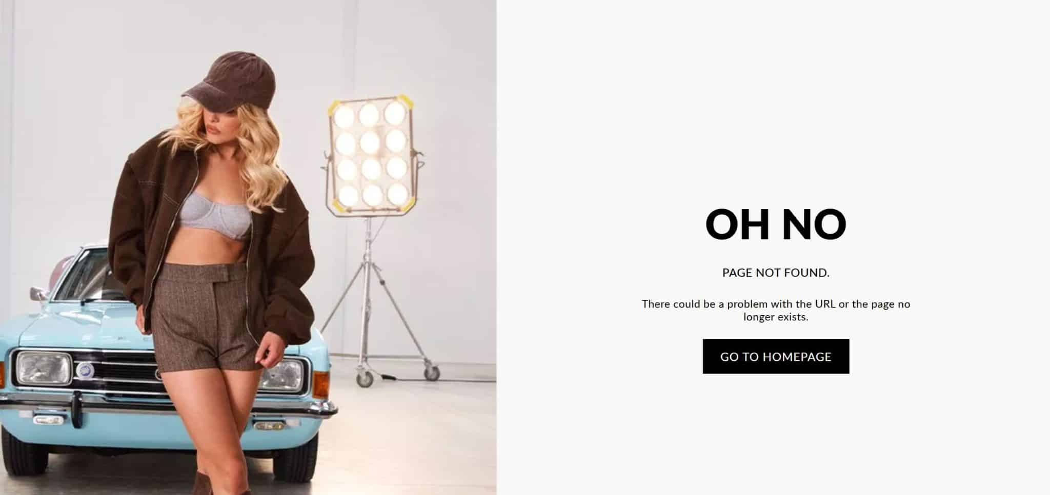
I’m not quite sure what to make of this 404 page. I like that there’s a big image, and I like that it says ‘oh no’ instead of the ‘oops’ that so many 404 pages tend to use.
However, I’m not a fan of the only way to get off this page being to click on the ‘go to homepage’ button. There’s no other navigation on this 404 page at all.
I’m assuming this was an intentional design choice, but given how search is such an integral part of fashion websites, this feels a little frustrating.
Coolness: 4/5
Creativity: 2/5
Functionality: 1/5
Burger King
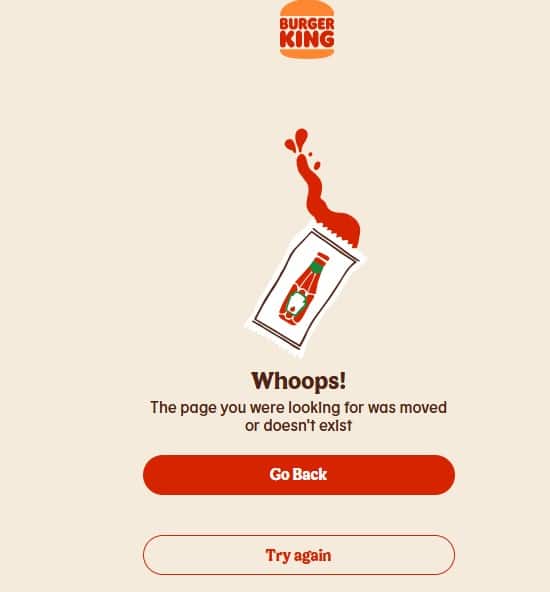
This 404 page is simple, friendly, and has a little bit of cheeky humour in the form of the nearly-empty ketchup packet.
However, I’ll admit that I’m not a big fan of the navigation buttons on offer. While the ‘go back’ button is handy, the ‘try again’ button won’t work if a page is missing, or the user came to the 404 page because of a typo.
It feels like this 404 page was designed for mobile – it could be that Burger King did its homework and found that most people access this page on a mobile device. Which is fair.
Coolness: 4/5
Creativity: 3/5
Functionality: 2/5
Channel 4
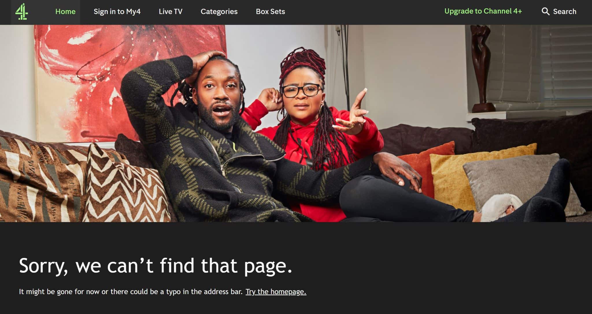
Channel 4 is known for being an unconventional broadcaster, so it makes sense that its 404 page reflects that quirkiness.
The image – from flagship show Gogglebox, sums up the frustration that a visitor might have from stumbling across a broken link.
I also like the casual vibe of the copy: ‘it might be gone for now or there could be a typo in the address bar.’
Coolness: 4/5
Creativity: 4/5
Functionality: 2/5
Coca Cola
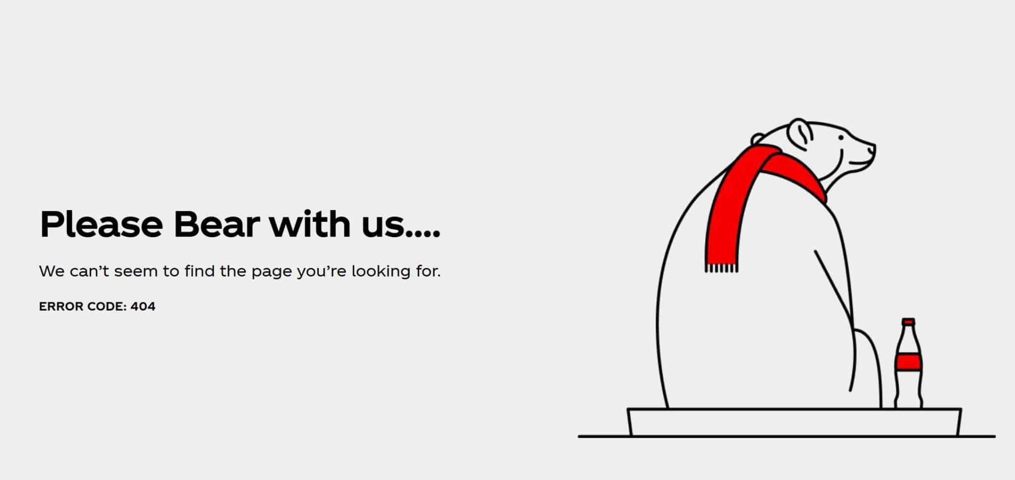
You know your branding is on point if someone can identify your business from your 404 page alone.
Red and white colour scheme? Check. Cuddly polar bear? Check. Unbranded but totally recognisable soft drinks bottle? Check and check.
This 404 page is super simple, but I love it. Okay, there’s no signposting to other pages, but I think the minimalist design works in Coca Cola’s favour here.
Coolness: 5/5
Creativity: 4/5
Functionality: 1/5
Co-op Live
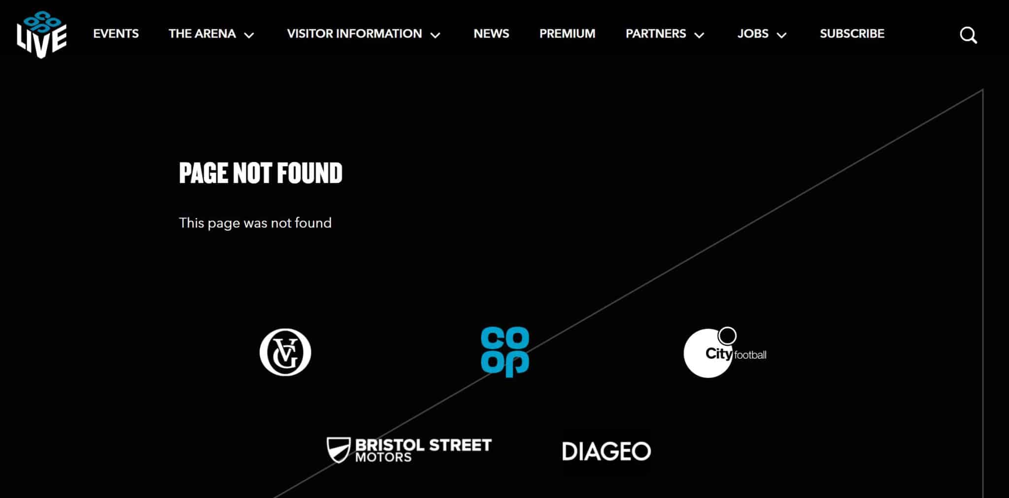
Yeeaaaaah, there’s simple 404 pages and there’s whatever this is. I’m hoping that the web developer forgot to put a proper 404 page in and this isn’t intentional.
It’s not good when the primary message is repeated twice and you dedicate more space to your sponsors than you do trying to signpost your site visitors to the right page.
Coolness: 2/5 (I like the black background and white text, but that’s about it)
Creativity: 1/5
Functionality: 1/5
Costa Coffee
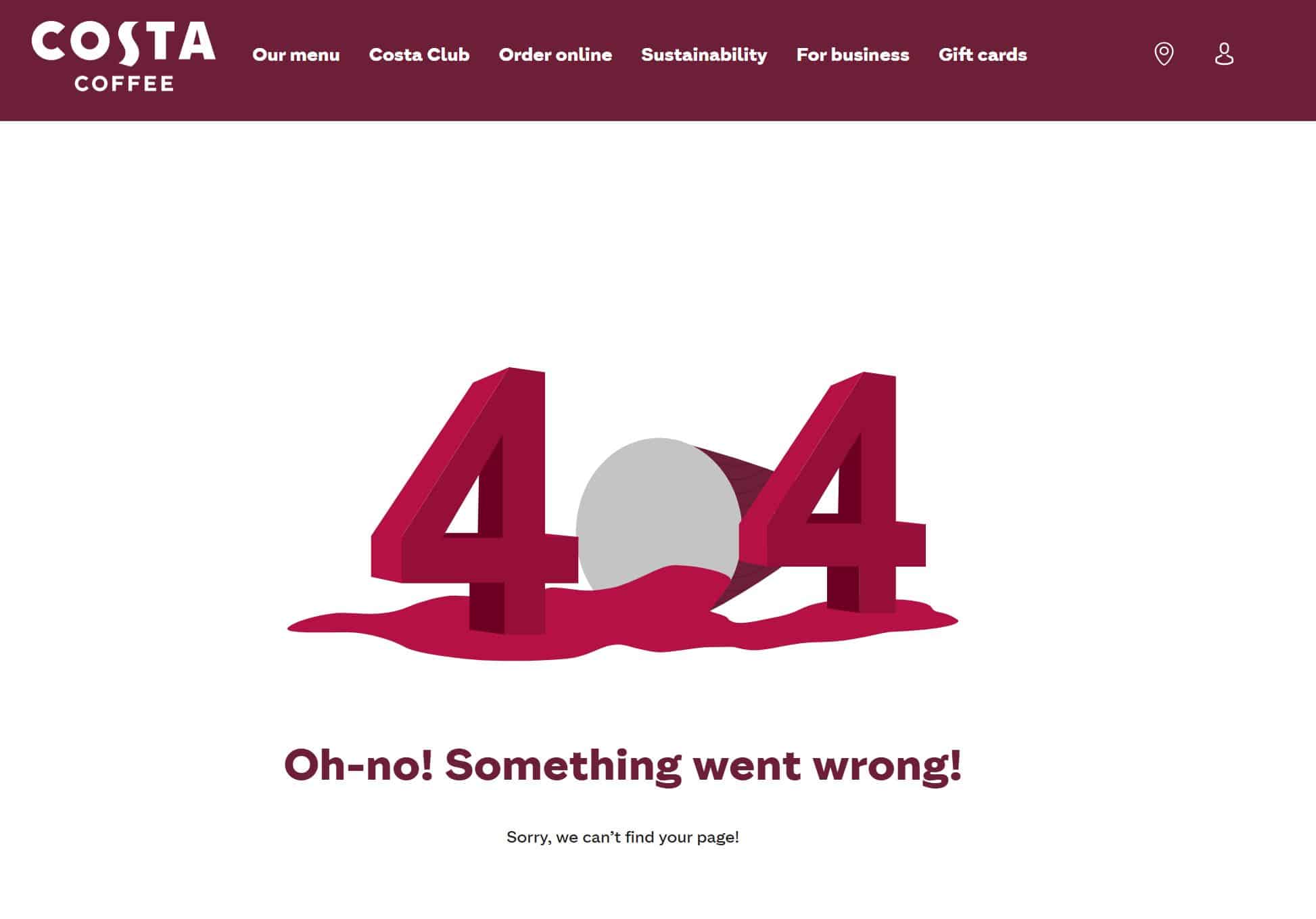
Okay, I like this page. The spilled cup representing the zero in ‘404’ is a nice touch, and the text is friendly and warm.
A couple of extra links would elevate this page a little more, but this is an decent showing.
Coolness: 3/5
Creativity: 4/5
Functionality: 1/5
Crocs
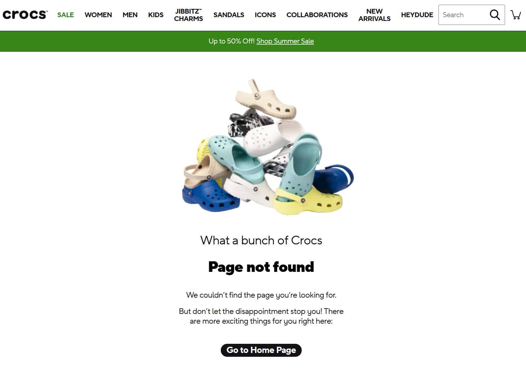
What I love most about this 404 page is how upbeat and positive it is. You’ve found a broken link – no big deal! Just get back on it and start browsing!
While this page could do with more navigation options, I do like the bundle of shoes, the ‘What a bunch of Crocs’ headline, and the optimistic copy.
Coolness: 4/5
Creativity: 4/5
Functionality: 2/5
Currys
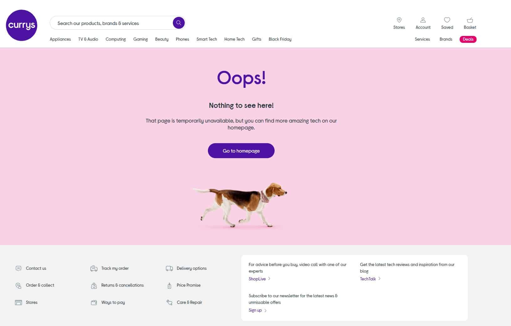
There’s something to be said about adding a pop of colour to your 404 page.
It makes it stand out and makes customers realise that they’re not able to access the page they were looking for.
The wording is good, there’s a shout-out to Curry’s ‘amazing tech’, and there’s a dog.
I’m not sure what a dog has to do with air fryers and smart TVs but I like dogs, so it’s all good.
Coolness: 4/5
Creativity: 3/5
Functionality: 2/5
Disneyland
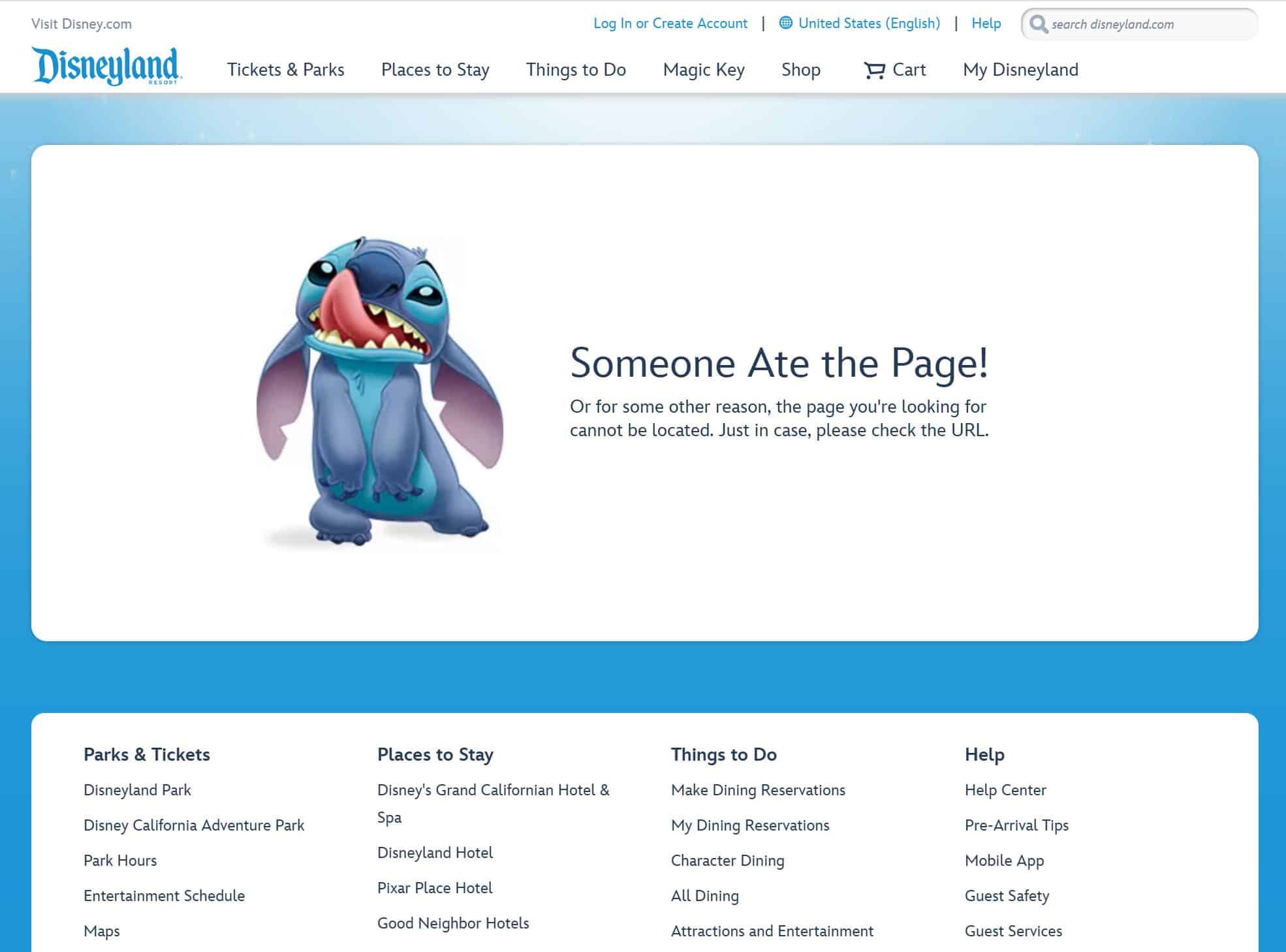
I’m a massive fan of a funny 404 message, so ‘someone ate the page!’ coupled with the world’s cuddliest alien resonates well with me.
There are also lots of links to help visitors find their way around. While a search box is great, sometimes you just need pointing to the right pages, especially if you’re on a mobile phone in the middle of a crowded theme park!
Could it be a little fancier? Possibly. But it’s cute, funny, and helpful, so it ticks all the boxes.
Coolness: 4/5
Creativity: 3/5
Functionality: 4/5
Drunk Elephant
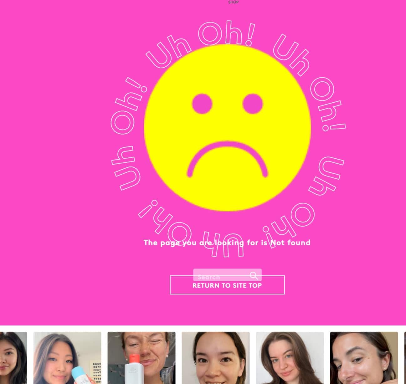
For those not in the know, Drunk Elephant is a skincare and beauty brand aimed at Gen Zers. With its hot pink background, animated text, and bright, sun-yellow sad face, this brand definitely gets its target audience.
Drunk Elephant also links to user-generated content (UGC), which is a great way to instil trust in the brand.
There are a few UX issues on this page – the search bar overlaps the call-to-action button, which causes a few problems. But it’s a good 404 page.
Coolness: 4/5
Creativity: 3/5
Functionality: 2/5
Dunelm
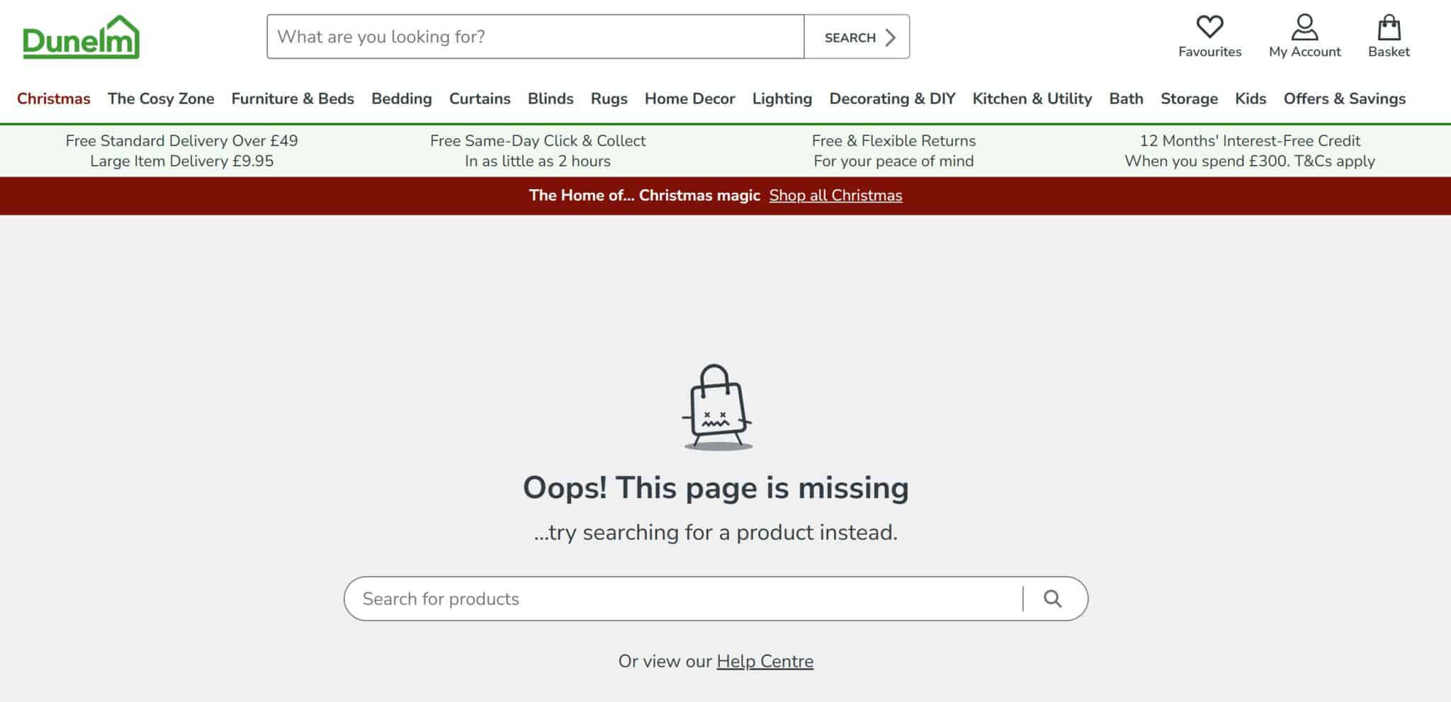
The image on this page makes me giggle. I don’t know what it is, but a shopping bag with x’s for eyes is absolutely hilarious and adds a little layer of whimsy to an otherwise standard 404 page.
I do like the big search bar on this 404 page too.
I think every time I’ve been on the Dunelm site I’ve ended up searching for exactly what I need rather than using the menu, so the marketing team evidently know their target audience.
Coolness: 3/5
Creativity: 2/5
Functionality: 4/5
Duolingo
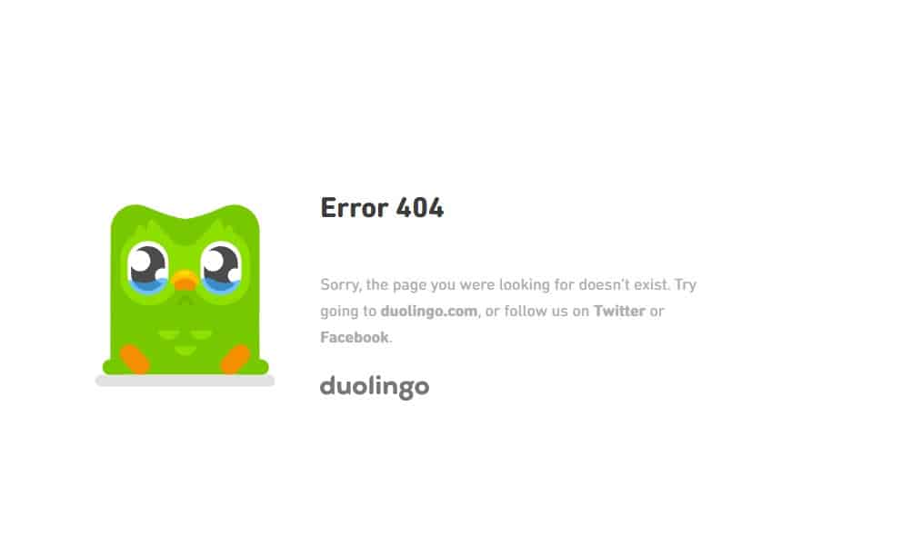
Given that Duolingo has a reputation for being, for want of a better word, unhinged, I was surprised by how subtle and unassuming this page was.
I like the crying mascot, but if you took that away, this page would be pretty bland.
It’s interesting how this 404 page encourages visitors to follow the brand on Twitter (not ‘X’ interestingly enough) and Facebook.
As Duolingo is pretty prominent on social media, this is a good way to increase followers and engagement.
Coolness: 2/5
Creativity: 2/5
Functionality: 3/5
Etsy
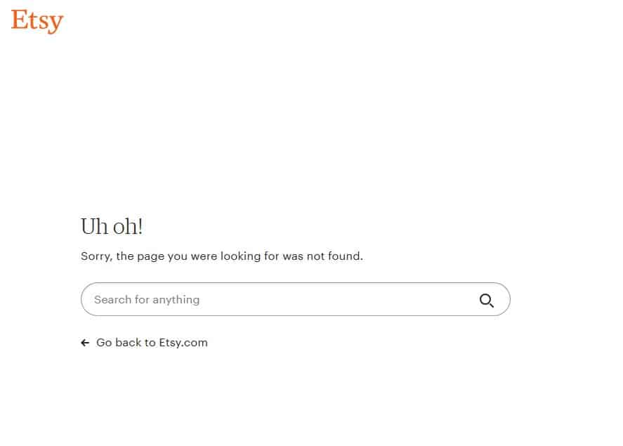
Yawn… this 404 page is functional, but boring.
The search bar and link back to the homepage do the job but like so many pages on this list, Etsy could have done a lot more.
Some pre-generated searches for popular items, or some nice photos of products could have taken this 404 page to the next level.
Coolness: 1/5
Creativity: 1/5
Functionality: 3/5
Finch
For those not in the know, Finch is a mobile app where you look after a baby bird by being kind to yourself. By practicing mindfulness, you make your pet happy and can earn points to buy them nice things.
Sounds sweet right? Here’s the website so you can see how cute and fluffy it is.
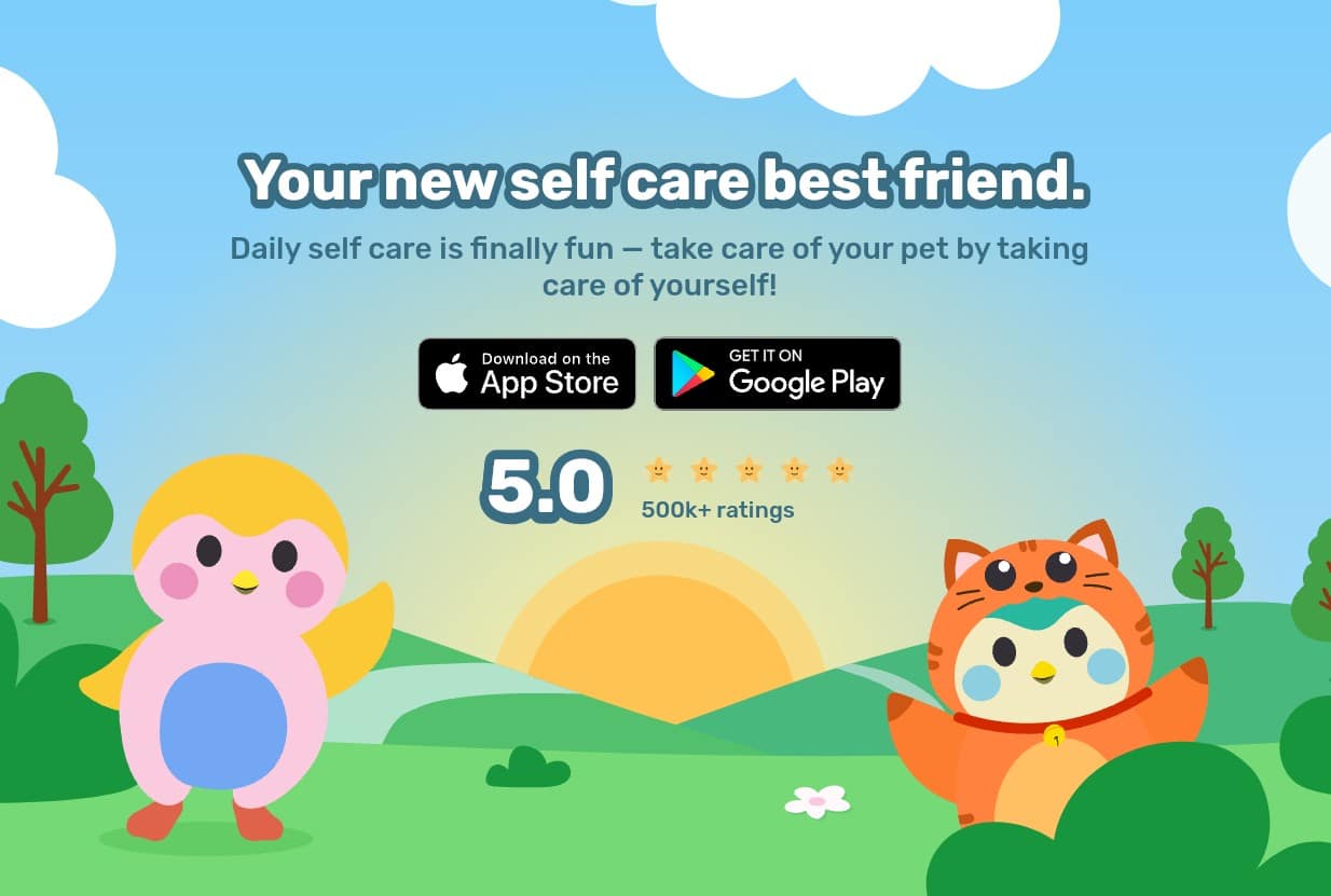
So you’d expect Finch’s 404 page to be equally lovely, wouldn’t you? WRONG
Ouch.
Such a missed opportunity. If there’s a vast disconnect between your brand and your 404 page, you risk confusing customers.
Coolness: 0/5
Creativity: -5/5
Functionality: 0/5
Firebox
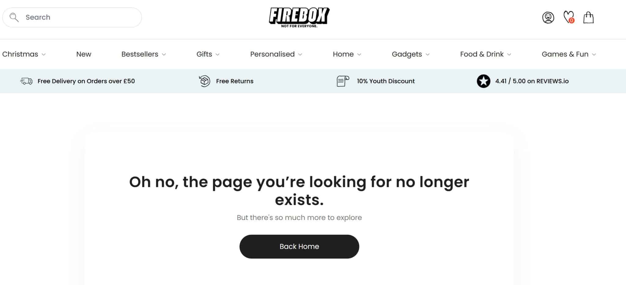
Like Aldi, Firebox is known for being quirky and funny, so this 404 page feels like a wasted opportunity.
Positive points: I like the ‘but there’s so much more to explore’ and the big blocky call-to-action.
But a few product images and a search bar would make this page so much more valuable than it currently is.
Coolness: 2/5
Creativity: 1/5
Functionality: 2/5
Foundry
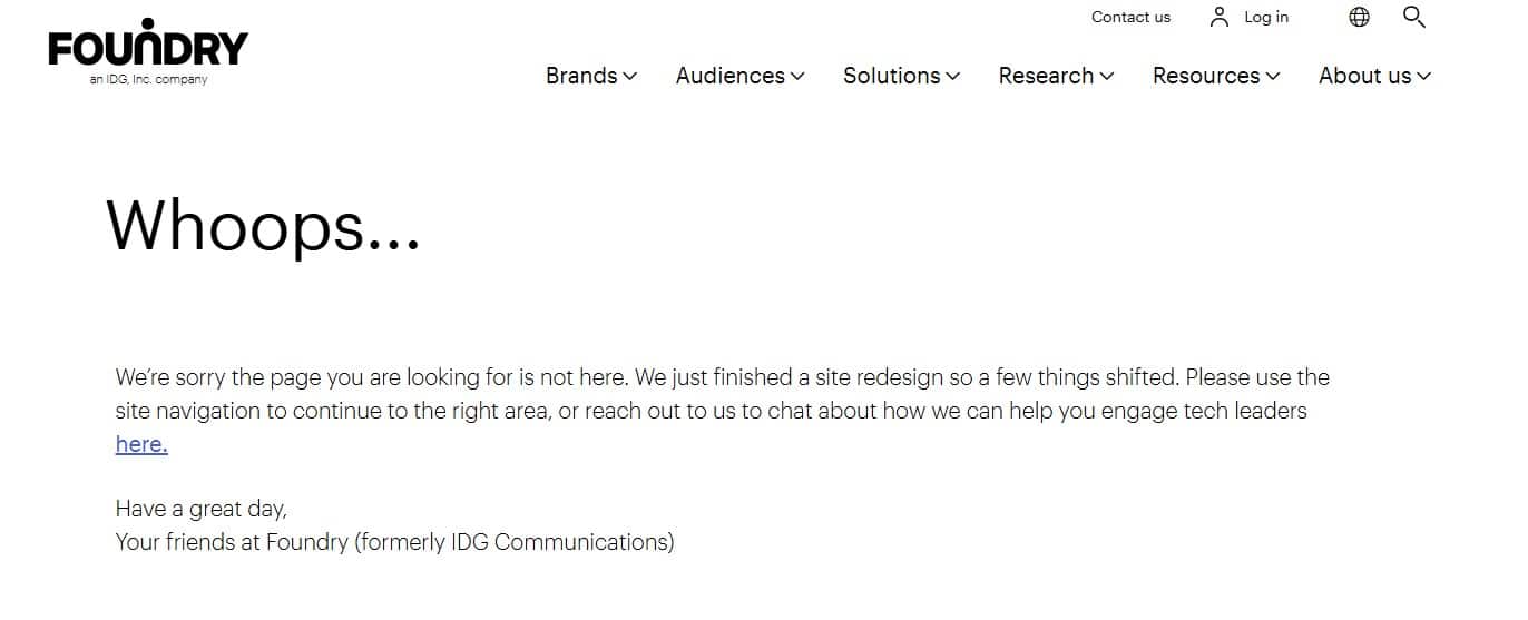
When I started writing this article, I wanted to predominantly focus on B2C businesses. However, I decided to include this 404 page as it’s well written and very comprehensive.
There’s an apology, an explanation about why the user might have stumbled upon a broken page, and how to get back on track. Plus, the sign-off is a nice touch.
It would have been nice to have links to the most popular pages, but that’s probably me being a bit picky.
Coolness: 3/5
Creativity: 4/5
Functionality: 2/5
Fy!
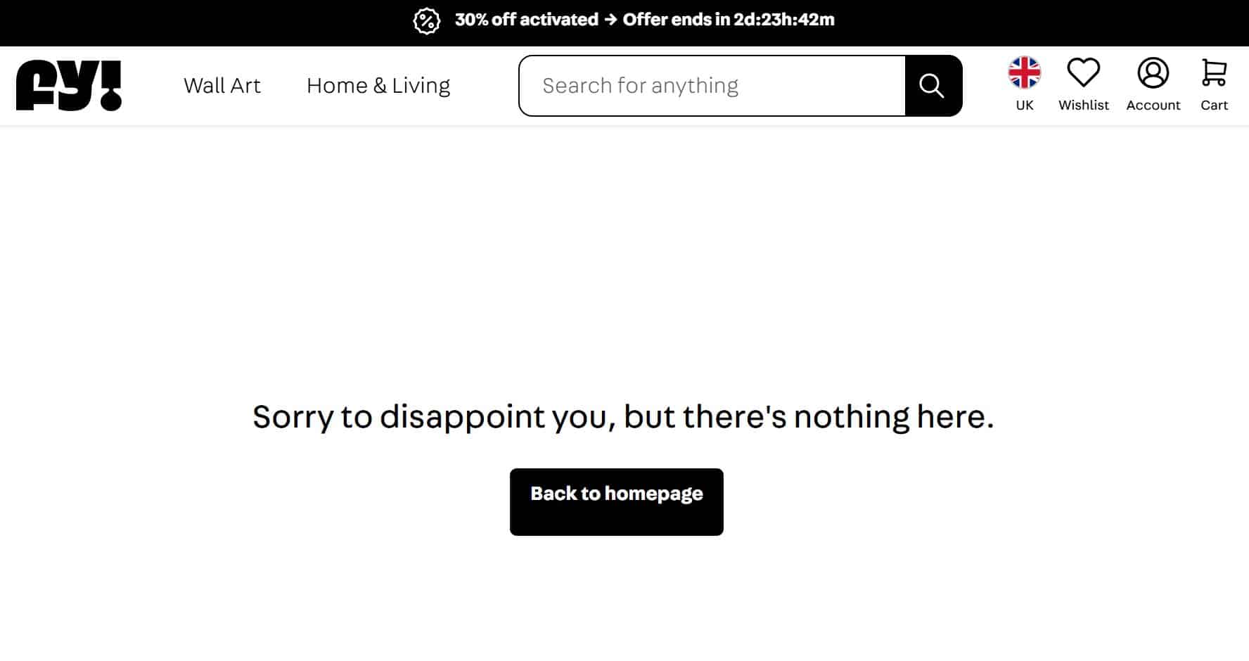
This 404 page is very minimalistic. I do like the message though – it’s far more direct and entertaining than the typical ‘oh no, this page isn’t here!’
A search bar would have been nice, but it’s definitely not the worst 404 page on this list!
Coolness: 2/5
Creativity: 3/5
Functionality: 2/5
Greggs
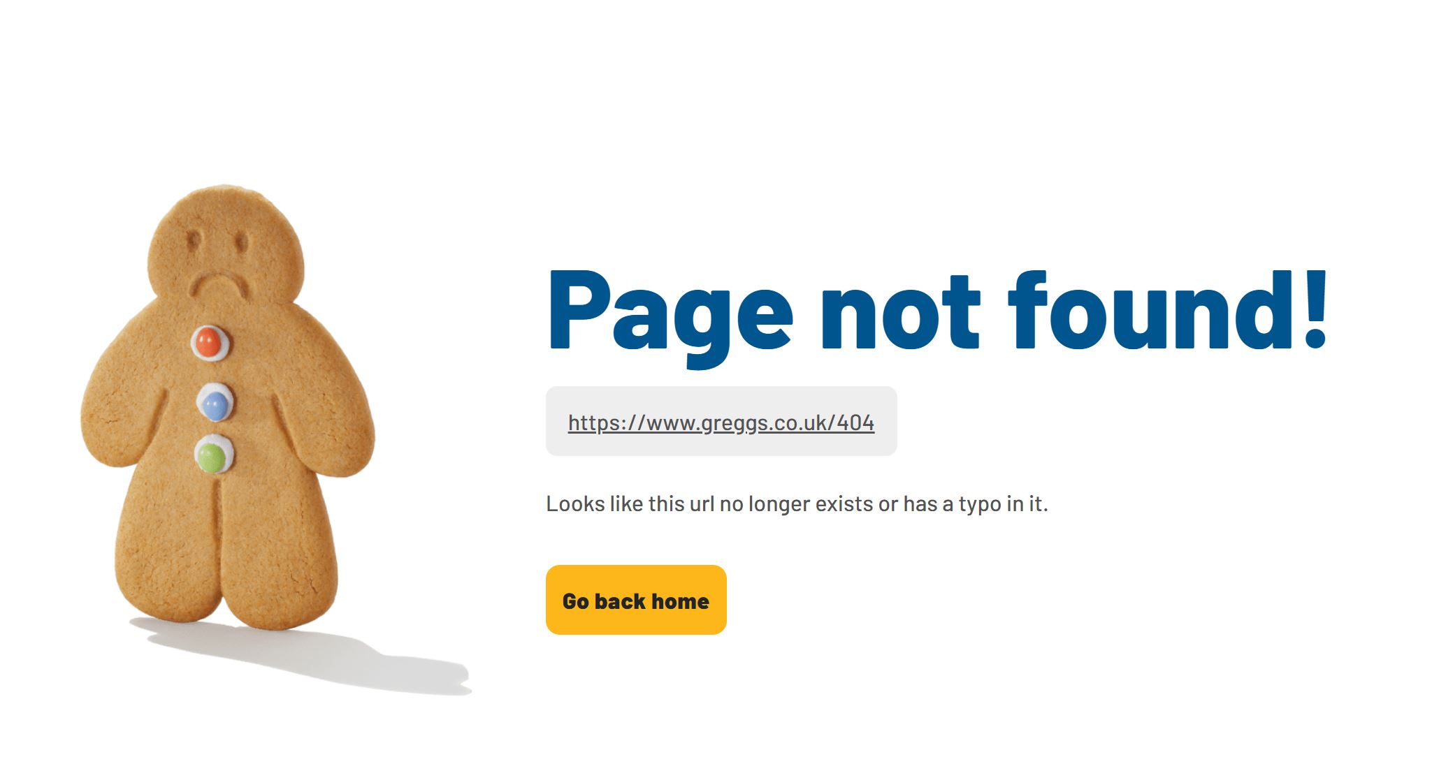
Greggs has one of the best approaches to marketing around, and I’m so glad it didn’t let me down with its 404 page. You’ve got the brand colours and a sad little gingerbread man – simple but effective.
(Interestingly Greggs uses the same gingerbread man, but smiling, on other pages on its website, so extra points for brand consistency.)
I also like how this 404 page reiterates the URL the user entered, so they can double-check they got it right. It’s a little thing, but it’s very helpful.
Coolness: 4/5
Creativity: 3/5
Functionality: 4/5
Hobbycraft
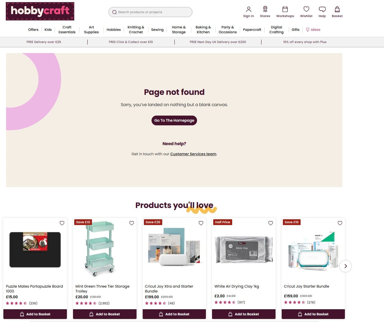
I love, love, love 404 pages that have punny, industry-specific messages rather than the generic ‘whoops – this page doesn’t exist!’
So Hobbycraft’s ‘sorry, you’ve landed on nothing but a blank canvas’ hits the spot.
I like that there’s a link to related products too.
Coolness: 3/5
Creativity: 3/5
Functionality: 3/5
Huel
Huel is one of those brands that is well-known for being minimalistic and a bit utilitarian. That being said, this 404 page takes the mickey.
You can have a basic and simple 404 page and still provide your site visitors with worthwhile information. Even a link back to the homepage would elevate this page and give it a bit of extra cred.
Coolness: 1/5
Creativity: 0/5
Functionality: 0/5
Ikea
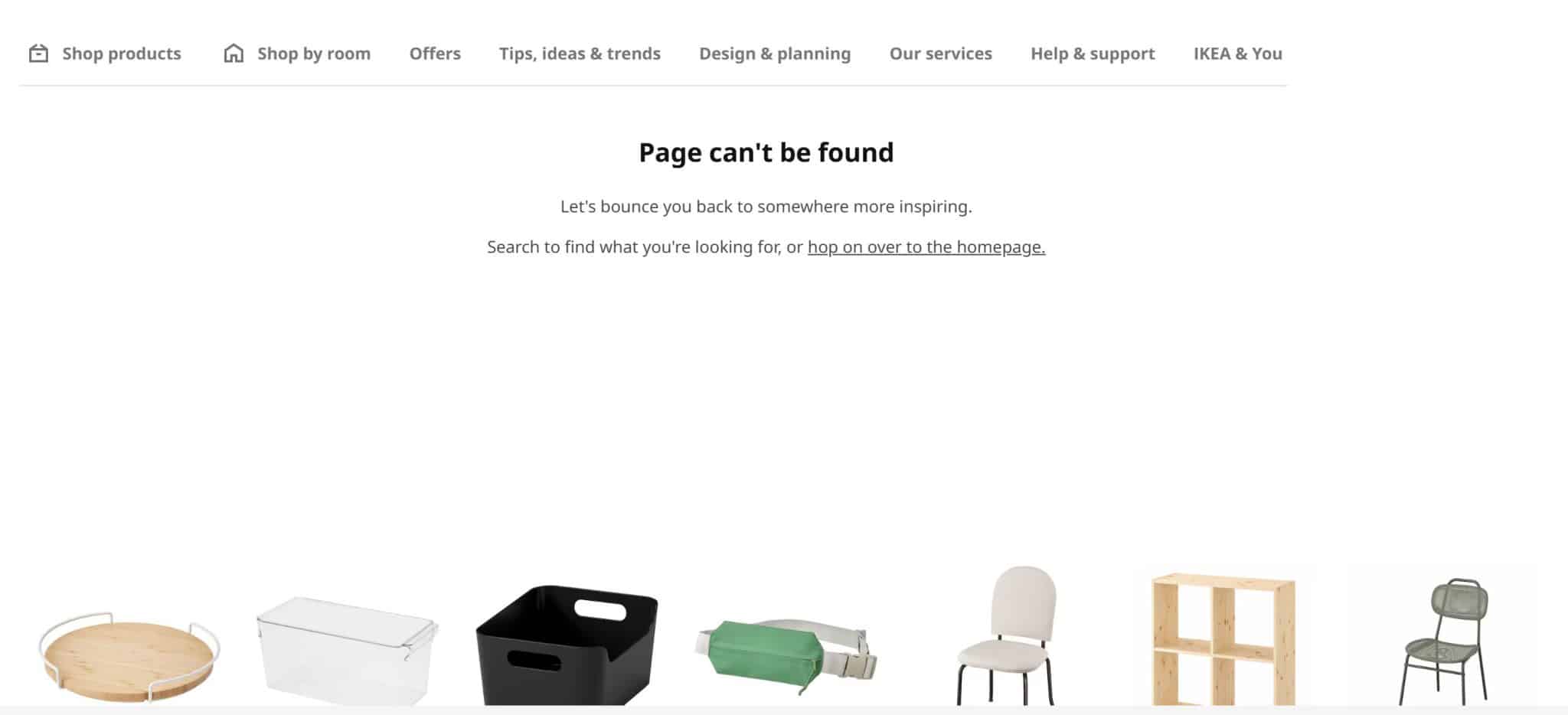
The Ikea 404 page looks a little simple upon first glance, although I do like the friendly, helpful, on-brand tone – ‘let’s bounce you back to somewhere more inspiring.’
When you look a little closer, this 404 page does something incredibly smart.
There’s a scrolling carousel of items at the bottom of the page. When you hover over one of the products, it provides more information and even lets you put the product in your basket.
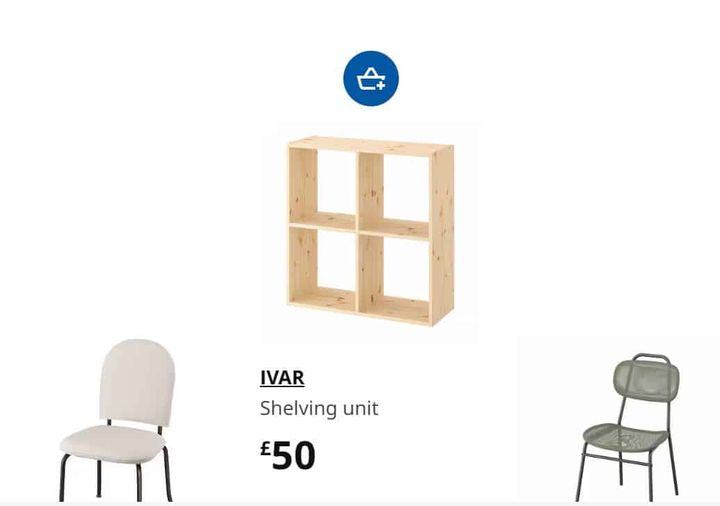
When you can cross-sell from your 404 page, you know your marketing strategy is on-point.
Coolness: 3/5
Creativity: 5/5
Functionality: 5/5
Innocent
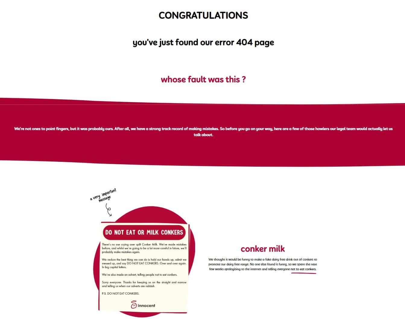
Now this brand got the brief when it came to creating a memorable 404 page. It’s funny, self-depreciating, and consistent with Innocent’s informal and authentic tone of voice.
The thing I love the most is that this 404 page lists all the mistakes Innocent has made, including typos on its labels and social media posts that didn’t quite hit the mark.
This page runs on for quite a while, so here’s the link if you want to check out all Innocent’s bloopers in all their glory.
Coolness: 5/5
Creativity: 5/5
Functionality: 2/5
Interflora
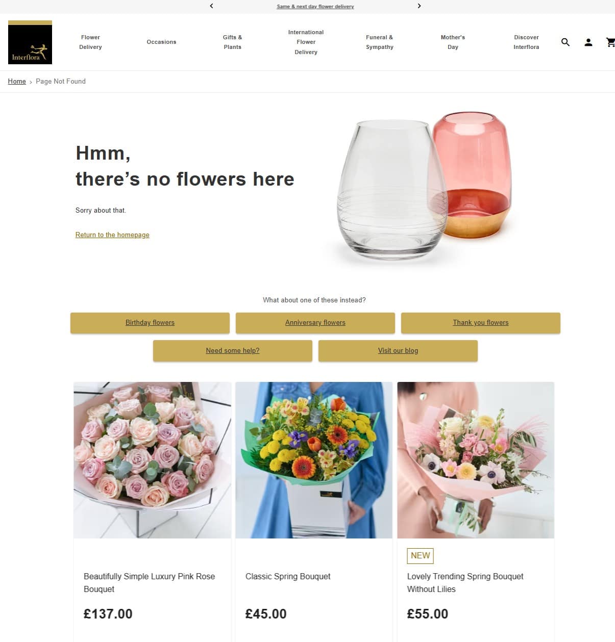
I’ll be honest, I wasn’t expecting big things when it came to Interflora’s 404 page, but I’m pleasantly surprised.
There’s a nice little pun, a clear image, and links to key pages, as well as examples of products customers might be interested in. It ticks all the boxes and stays true to the Interflora brand. Good work.
Coolness: 4/5
Creativity: 4/5
Functionality: 4/5
Itsu
You know your 404 page is working well when it’s perfectly aligned with your brand identity. With its chunky fuchsia font and grey imagery, this 404 page is actually pretty decent showing for Itsu.
(I would personally love a little sushi humour like, ‘let’s roll over to the homepage’ but that’s just me being a nerd.)
Coolness: 4/5
Creativity: 3/5
Functionality: 3/5
Jet2.com
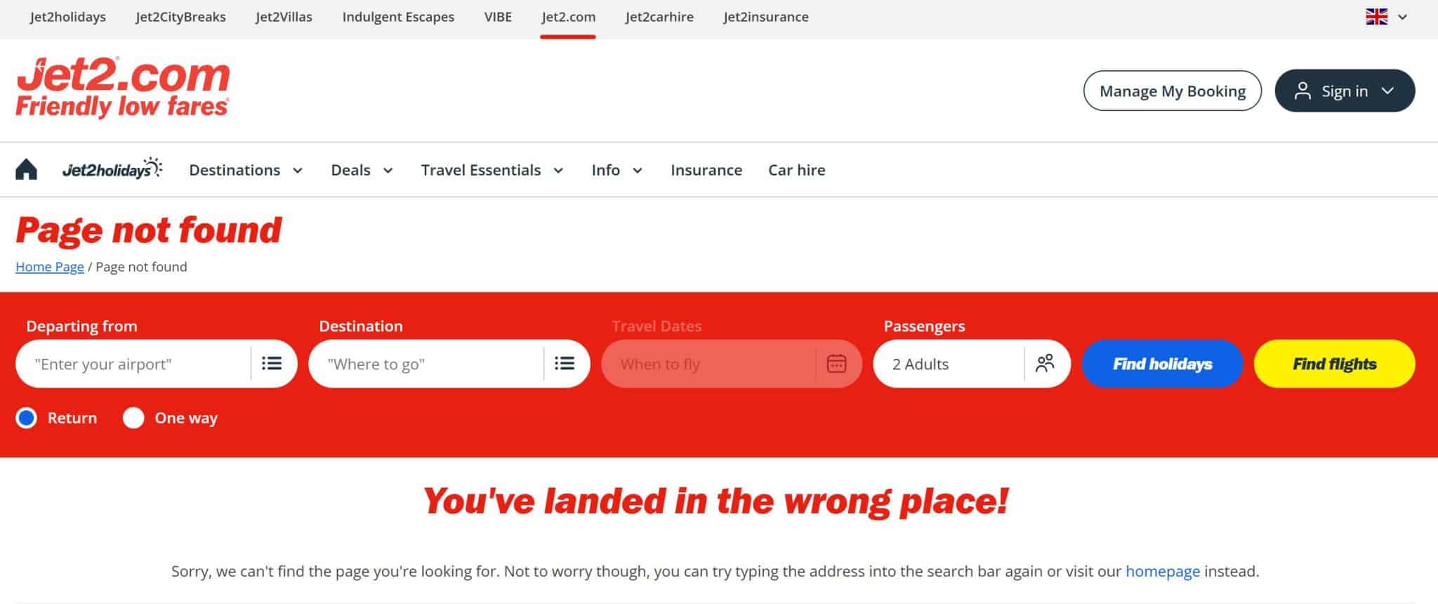
Before I check out a brand’s 404 page, I try to visualise what I think it will be like.
Jet2.com’s 404 page is a lot more simpler than I thought it would be in my head.
I like the ‘You’ve landed in the wrong place’ header, but it’s quite basic.
A little cartoon of an aeroplane would have worked well here, or a collection of curated links – remember that your 404 page is a great opportunity to promote links your customers might like.
Coolness: 2/5
Creativity: 2/5
Functionality: 3/5
John Lewis
I like this 404 page – it’s clean, understated, and has a little bit of humour, which as you can guess, I’m totally here for.
A few more links to relevant pages would be good, but a solid effort.
Coolness: 4/5
Creativity: 3/5
Functionality: 2/5
Lego
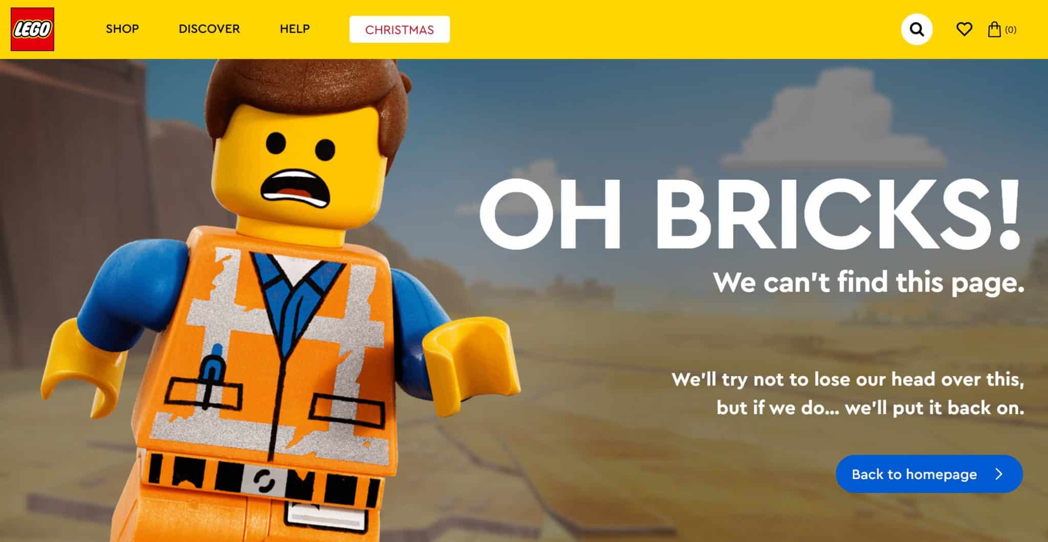
Another brand that gets it right. I love the nod to the Lego Movie and the fun language – a 404 page doesn’t have to be dull and technical.
More links would have been good rather than just a link to the homepage, but that’s me being picky.
Coolness: 4/5
Creativity: 4/5
Functionality: 2/5
Lucy and Yak
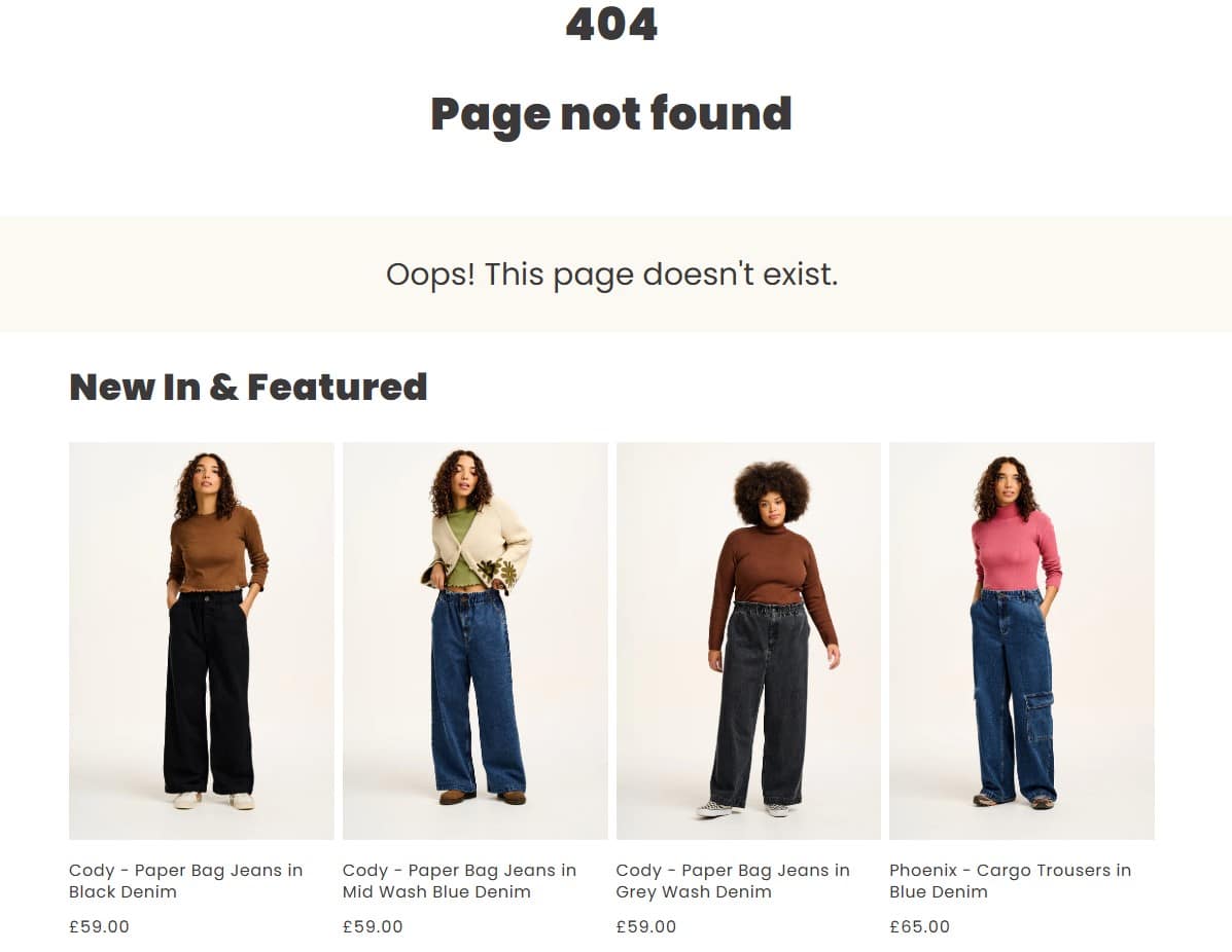
If I had to describe Lucy and Yak’s 404 page in one word it would be ‘okay’. And when you work in digital marketing, saying something is ‘okay’ is essentially the kiss of death.
It’s clear and has links to new and featured products, which is good. But it all feels a little bland, especially when Lucy and Yak is so well-known for bright colours and lively prints.
Coolness: 2/5
Creativity: 2/5
Functionality: 2/5
Kickers
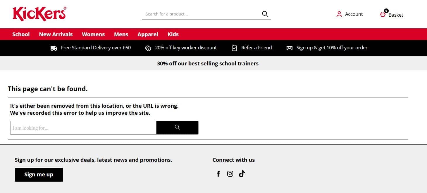
We’ve seen quite a few cool eCommerce 404 pages already, so it’s quite sad to see that Kickers has done the bare minimum.
Plus points – there’s a search bar and the brand mentions that it’s logged the error. But where are the photos, the links to best-selling products? Blah.
Coolness: 1/5
Creativity: 1/5
Functionality: 3/5
M&S
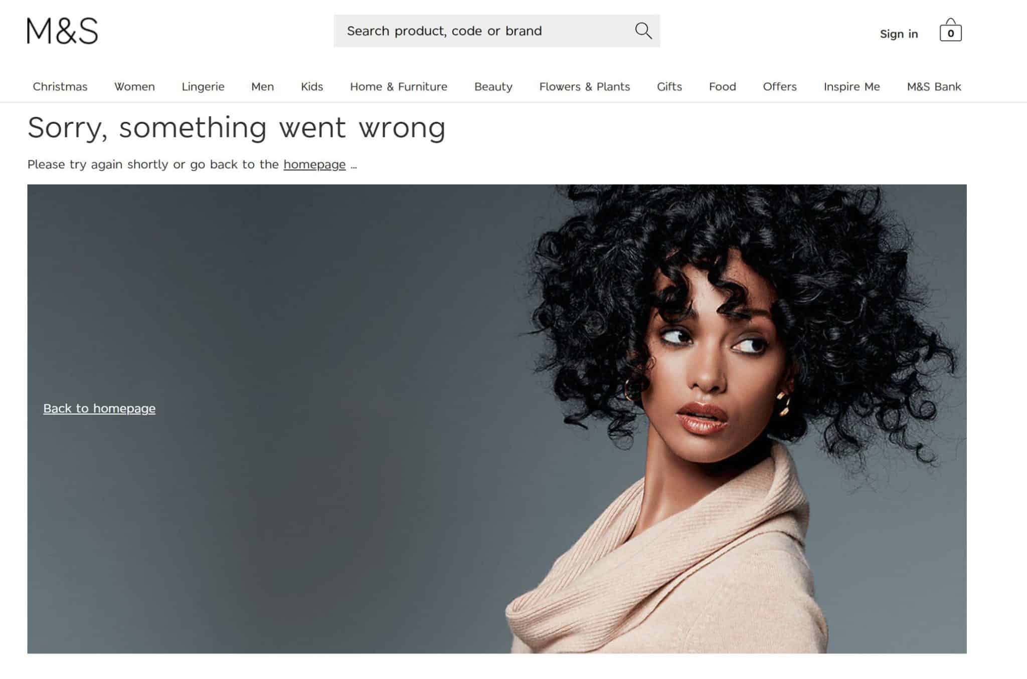
First thought when I saw this 404 page? ‘Wow, that’s a large image’.
It feels like wasted space to me – instead of having a big photo as the focal point you could have links to relevant parts of the site or images of new and popular products.
Yeah, not a fan of this one.
Coolness: 3/5
Creativity: 1/5
Functionality: 1/5
MTV
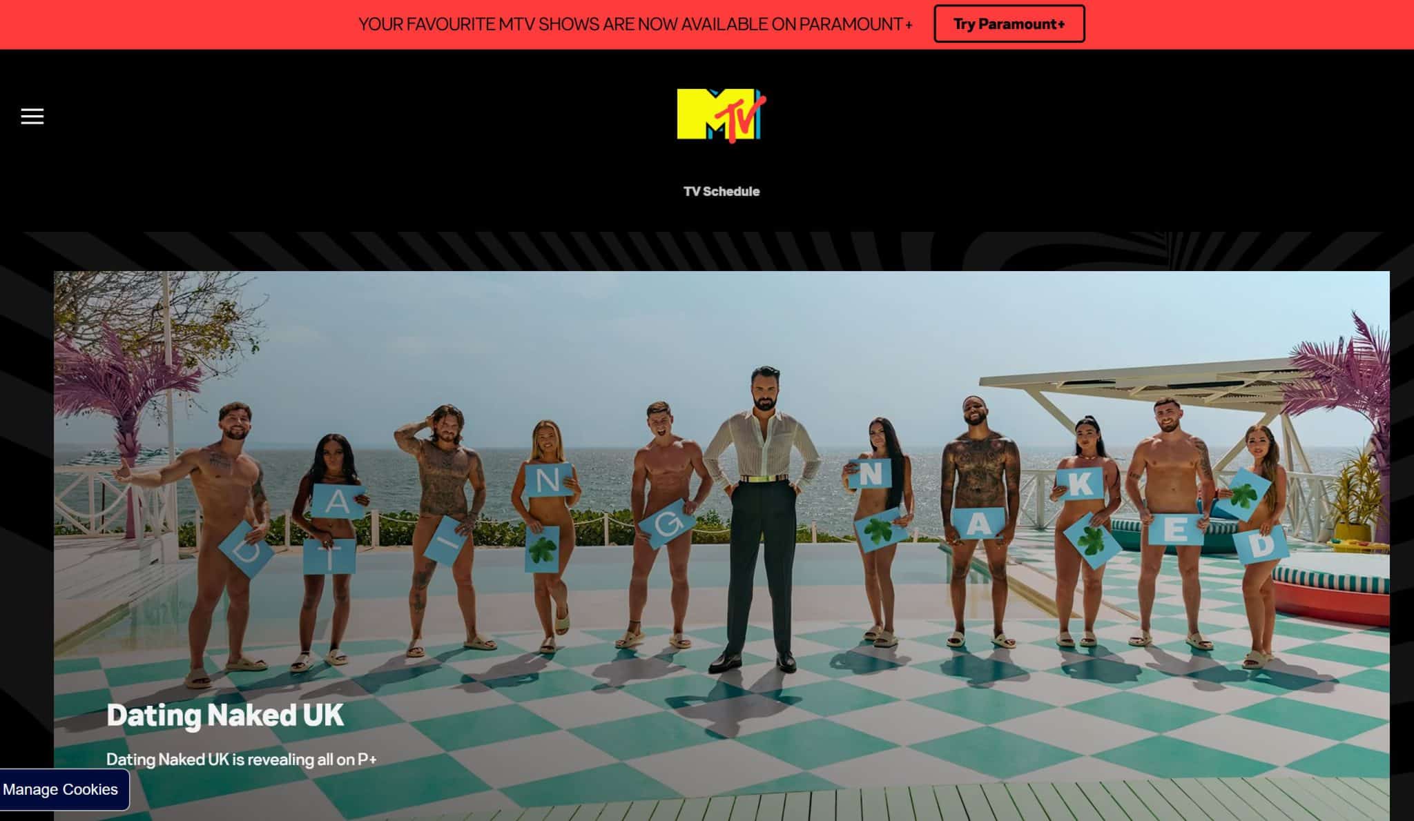
At this point you might think something’s gone wrong or I’ve got fed up with reporting on 404 pages, as I’ve provided a screenshot of MTV’s homepage.
And that’s the issue. MTV doesn’t have a 404 page. Instead it automatically redirects visitors to its homepage.
Redirects can be useful on websites, and I’ll talk about how you can use them in place of 404 pages in the FAQ at the end of this article.
The issue is that redirects need to be contextual. If someone is trying to view a specific page, you need to redirect them to a page that offers similar value.
Otherwise, use a 404 page to tell them the page they want no longer exists and signpost them to another part of the site.
If you force everyone back to your homepage, you’re just going to end up confusing them.
Even Google has waded in on this, saying that redirecting 404 pages to a homepage can have a negative impact on SEO and annoy users.
So no, I don’t want my MTV on this occasion.
Coolness: 0/5
Creativity: 0/5
Functionality: -5/5
Nando’s
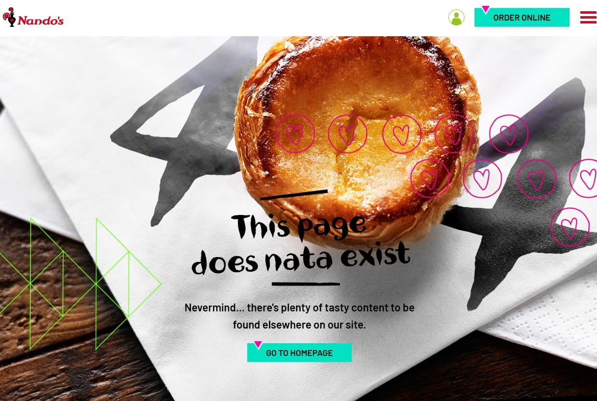
I love a good Portuguese custard tart. You can get them frozen at Tesco’s, so when I’m feeling fancy, I’ll grab one out of the freezer, let it defrost and have me a tasty sweet afternoon treat.
So I was so delighted to see this 404 page from Nando’s. Lovely photo, a cheeky little pun, nice bright colours, and a link back to the homepage.
You probably know what I’m going to say could be improved… More signposted links to relevant pages. But even so, this is a fantastic 404 page.
Coolness: 5/5
Creativity: 4/5
Functionality: 2/5
Nintendo
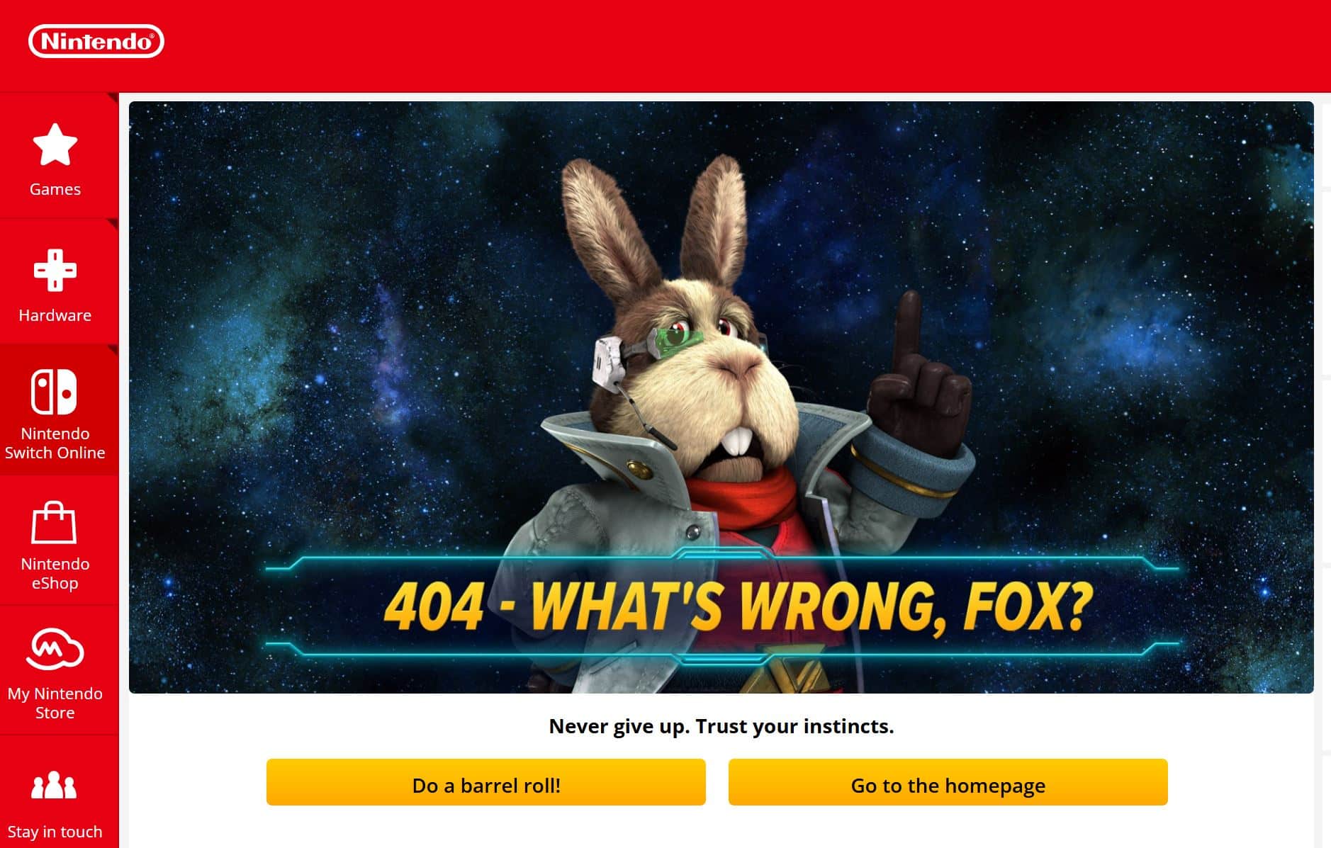
Did you ever play Star Fox on the SNES? It was essentially Asteroids on performance-enhancing drugs. It was ace.
I love how this 404 page is a call-back to the franchise. The best thing though? If you click on the ‘Do a barrel roll!’ button.
I’ll give you two minutes to visit the page and click on it. Go on. Do it now. It’s totally worth your time.
Okay, there’s not a lot of signposting on this 404 page – just a link back to the homepage. But I’m going to overlook that because I’m a sucker for gaming nostalgia.
Coolness: 4/5
Creativity: 5/5
Functionality: 2/5
Newcastle United Football Club
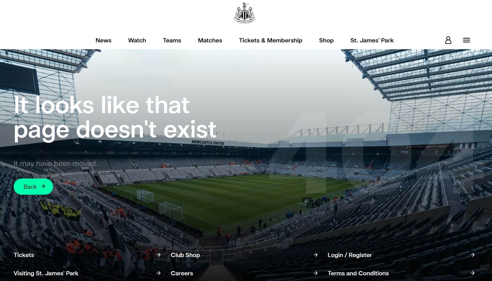
You don’t get many 404 pages that have a massive image with text overlaid, but this one works reasonably well.
The grey text is a little dark and not ideal accessibility-wise, but I like the links at the bottom and the green call-to-action button.
Coolness: 5/5
Creativity: 2/5
Functionality: 3/5
Octopus Energy
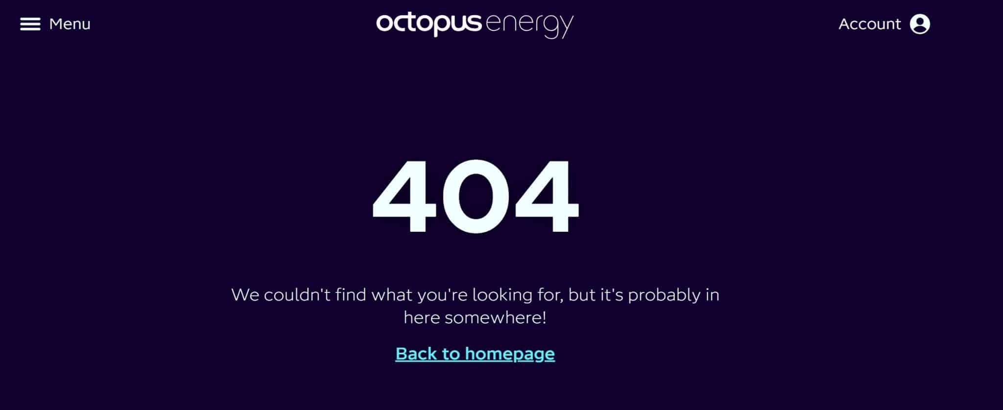
Again, this is one of those 404 pages that is perfectly serviceable, but the brand could have had a lot more fun with.
I like the bold navy background and the friendly message, but that’s about it., Octopus Energy has a cute purple octopus mascot it could use here. It could even feature some interesting energy-saving tips to provide value.
Know what your brand values are and showcase them on your page.
Coolness: 2/5
Creativity: 1/5
Functionality: 2/5
Office
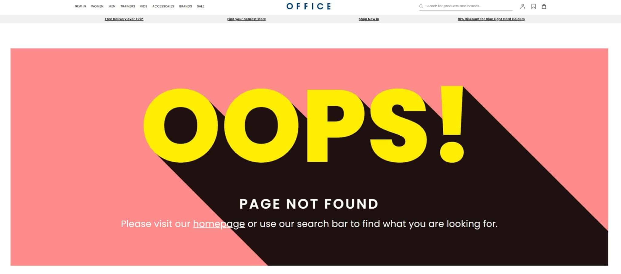
Here’s an interesting fact for you. This is the 404 page which inspired this article.
I was looking for a pair of welly boots to walk the dog in, when I came across this 404 error page. I thought to myself ‘this page is nice and bright, but it doesn’t really do much to help me get back on track.’
And 50-odd 404 pages later, here we are.
So yes, I like the bright, bold colors on this page (although the salmon pink background and white text are a bit iffy from an accessibility standpoint), but a few additional links could have made it a lot better.
Coolness: 3/5
Creativity: 2/5
Functionality: 2/5
Ordnance Survey

Oh boo, get out. This 404 page is rubbish.
Coolness: 0/5
Creativity: 0/5
Functionality: 0/5
Peroni
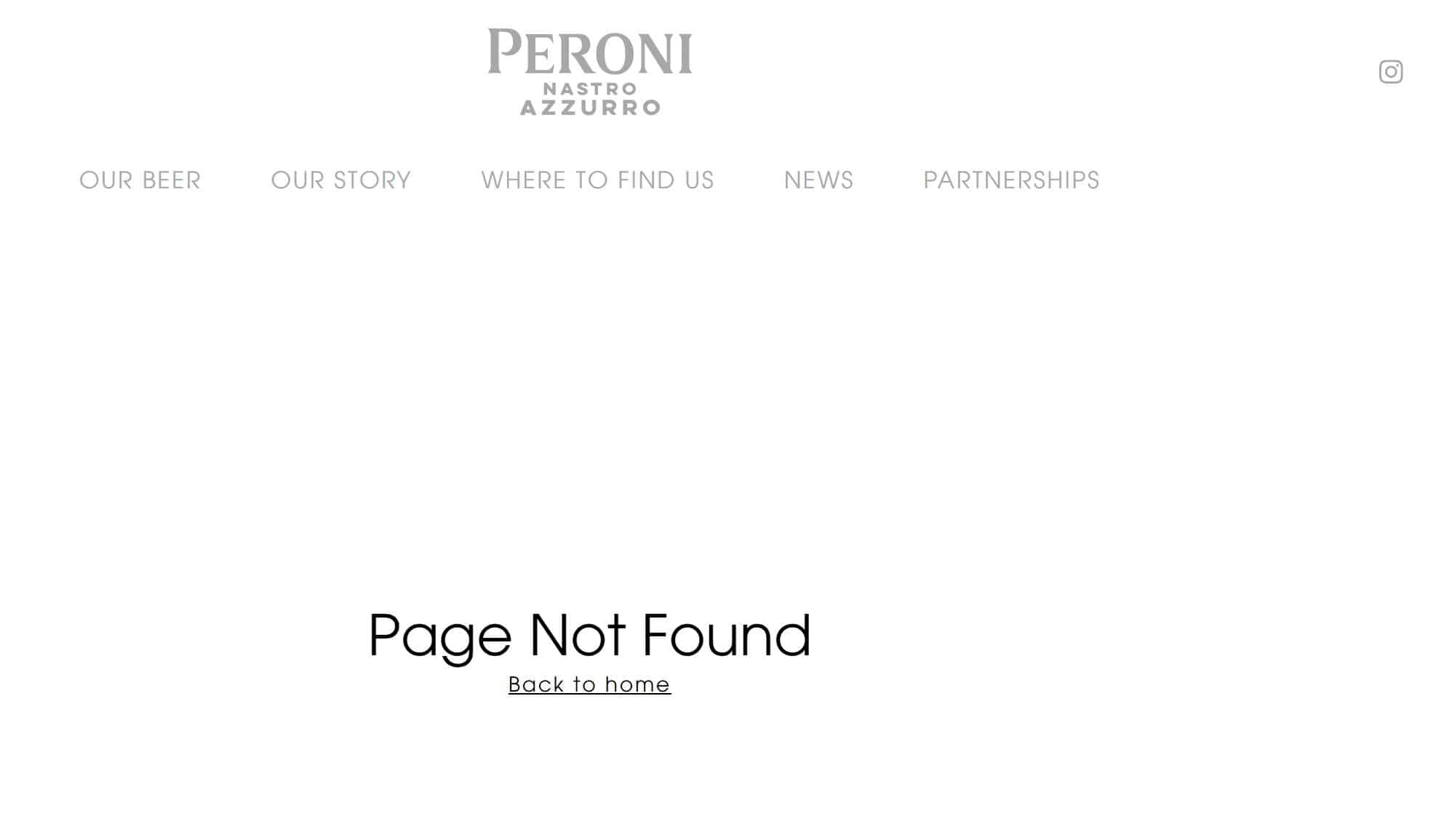
If I could say something nice about this 404 page it would be…. it exists?
It clearly states that it’s a 404 page and has a link back to the homepage, but that’s about all that’s going for it.
You don’t have to go over the top, but come on, use the space you have.
Coolness: 1/5
Creativity: 1/5
Functionality: 1/5
Pets at Home
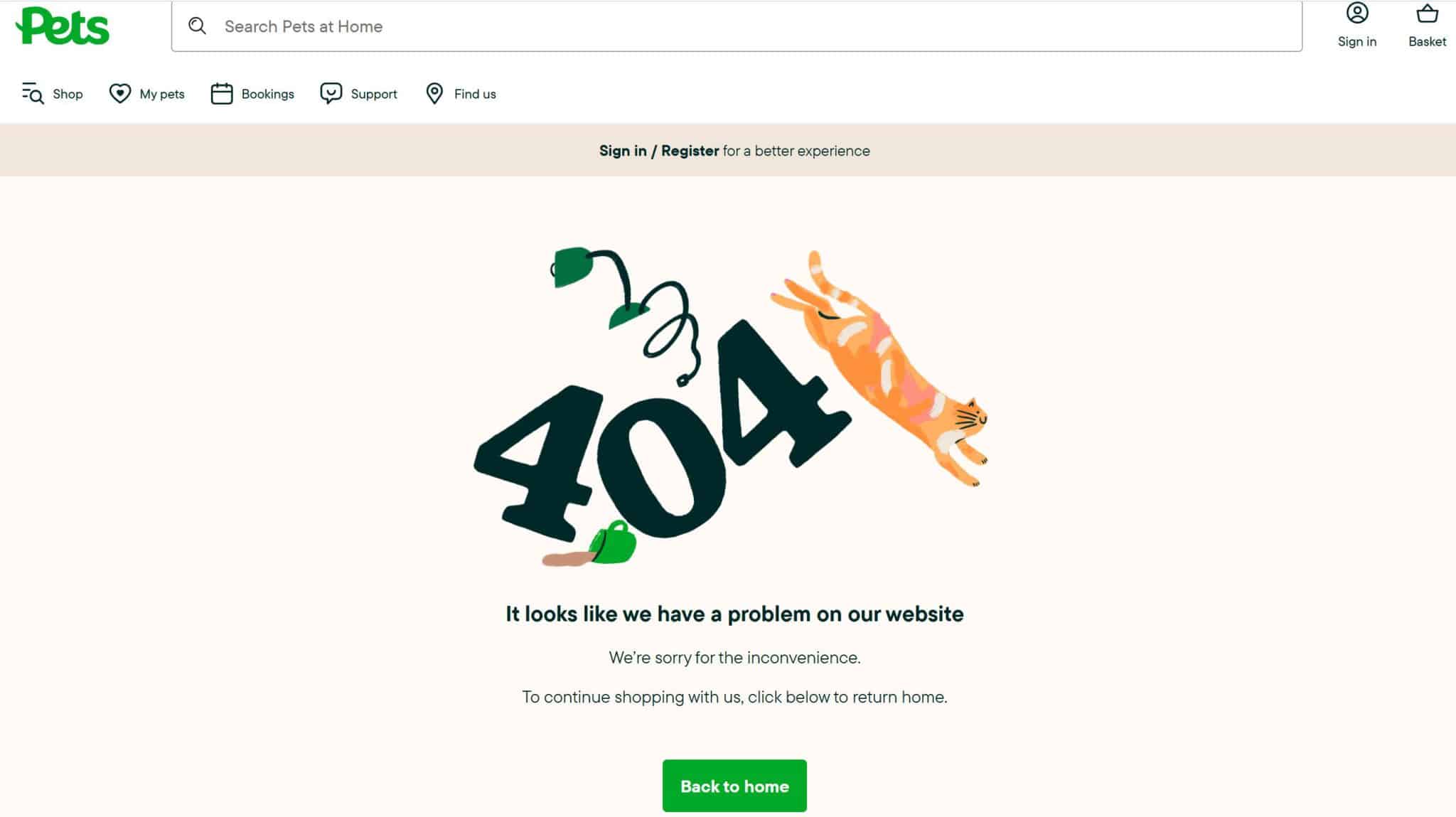
This 404 page is right on brand for Pets at Home, and something that all pet owners can relate to!
The image is gorgeous and I love the flashes of green that tie in with the brand identity.
Could there be more links to signpost visitors to the right place? Maybe, but I still love this one.
Coolness: 5/5
Creativity: 4/5
Functionality: 2/5
Pokémon
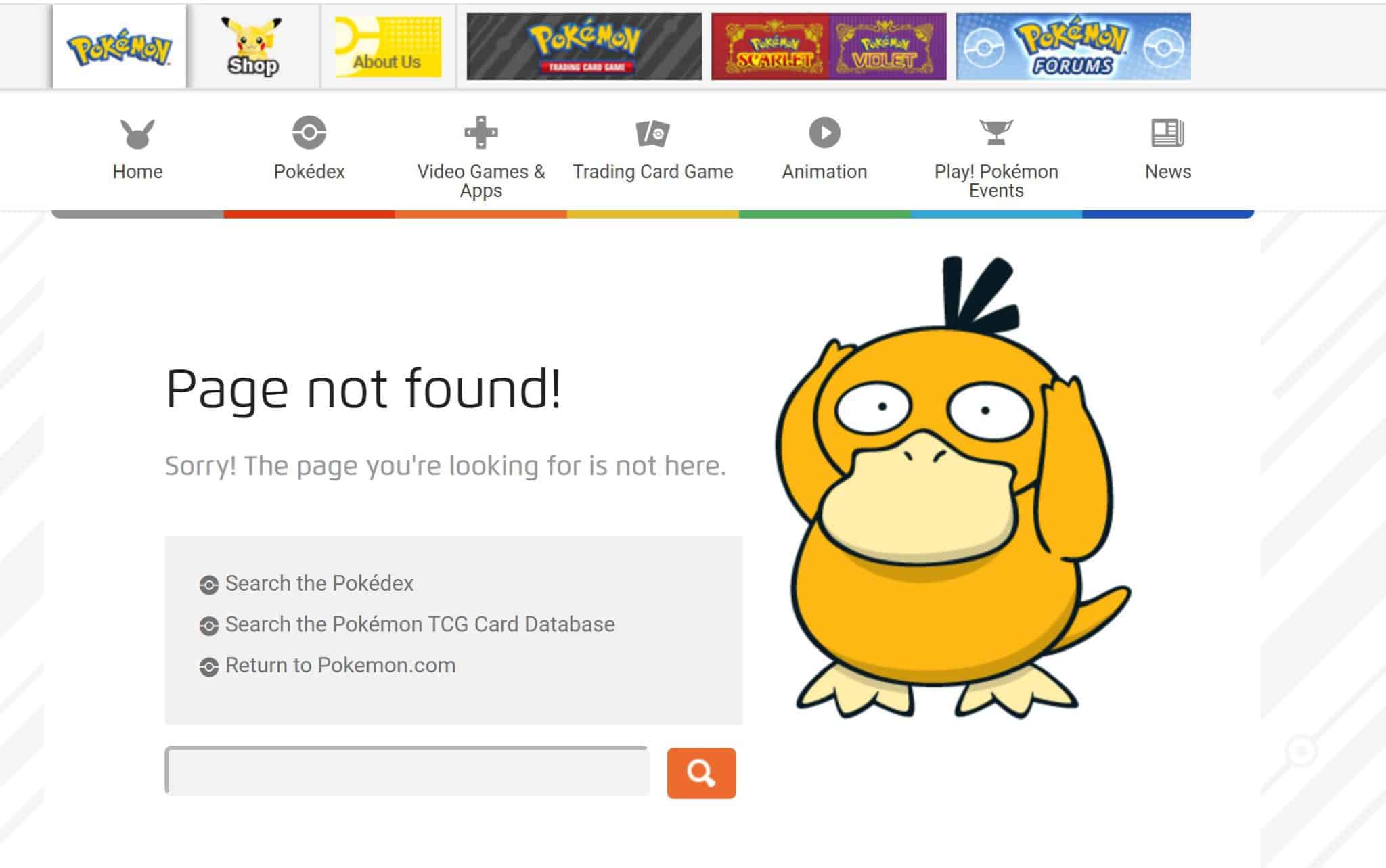
It’s fair to say that this brand knows its audience very well. For those not in the know, Psyduck is a forgetful Pokémon who is prone to getting things wrong!
There’s a link to all the most popular pages, as well as a search bar for visitors looking for a specific piece of content. A good 404 page all round.
Coolness: 3/5
Creativity: 4/5
Functionality: 4/5
Poundland
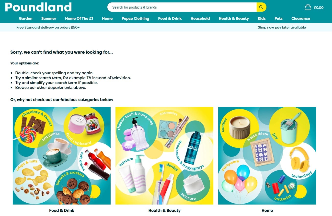
Poundland is another brand which is known for being loud and vivid, so I was surprised to see a mature and sensible approach to its 404 page.
I like how it breaks down how to resolve the issue, from double-checking for typos to searching for an alternative word or phrase. You don’t see this a lot, and it’s refreshing.
Despite this, there’s still consistency with the Poundland brand, with bright images representing the different departments, and mentions of its ‘fabulous’ product categories.
Coolness: 5/5
Creativity: 3/5
Functionality: 4/5
Puma
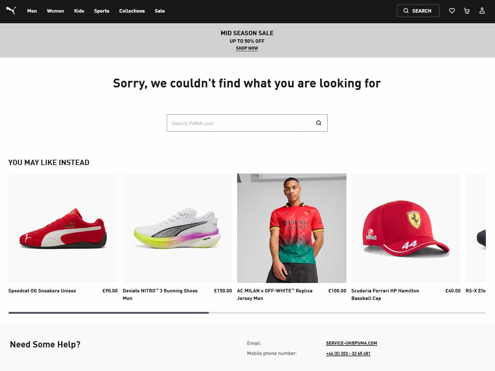
This page isn’t the fanciest or the most memorable. But you know what? It does the job.
There’s a clear message, a search bar, and a link to related products, which if you’ve read the rest of my 404 page reviews, I’m always clamouring for.
However, do people really pay £40 for a baseball cap? Bonkers.
Coolness: 3/5
Creativity: 3/5
Functionality: 5/5
Rainforest Cafe
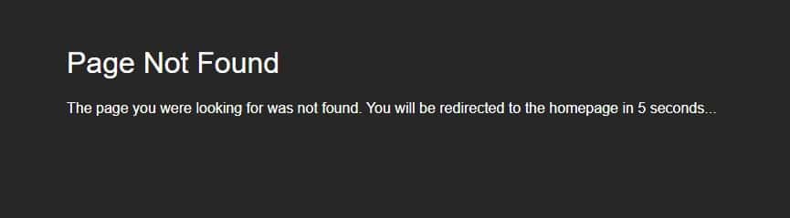
Earlier on, I chewed out a brand for redirecting site visitors to its homepage rather than displaying a 404 page.
This approach is slightly better, but still not good. Rainforest Cafe displays a (very basic and bland) 404 page and proceeds to redirect visitors to the home page after five seconds.
The issue is that this is not enough time to make people aware of the 404 error. Let’s say someone goes to the site and looks away from their mobile to speak to someone. They’d just see the homepage and be none the wiser.
Just leave the 404 page up – there’s no shame in it.
Coolness: 0/5
Creativity: 0/5
Functionality: -5/5

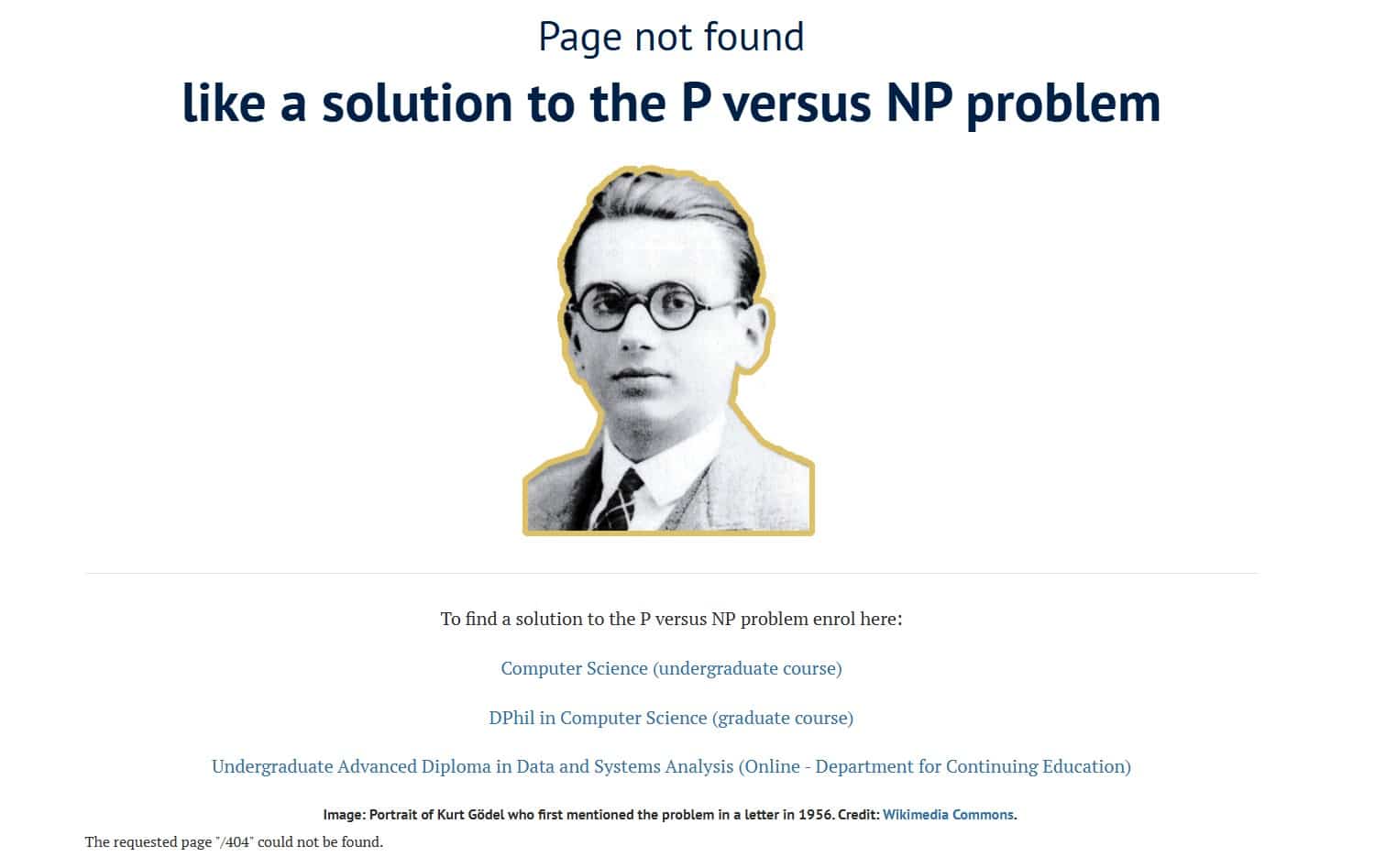
Nope. This is a pretty rubbish 404 page for the self-proclaimed ‘heart of the internet’.
It looks like it was designed for mobile, which I get. However, there’s nothing to stop a brand from having a separate 404 page for desktop and mobile.
Coolness: 1/5
Creativity: 0/5
Functionality: 1/5
Sainsbury’s
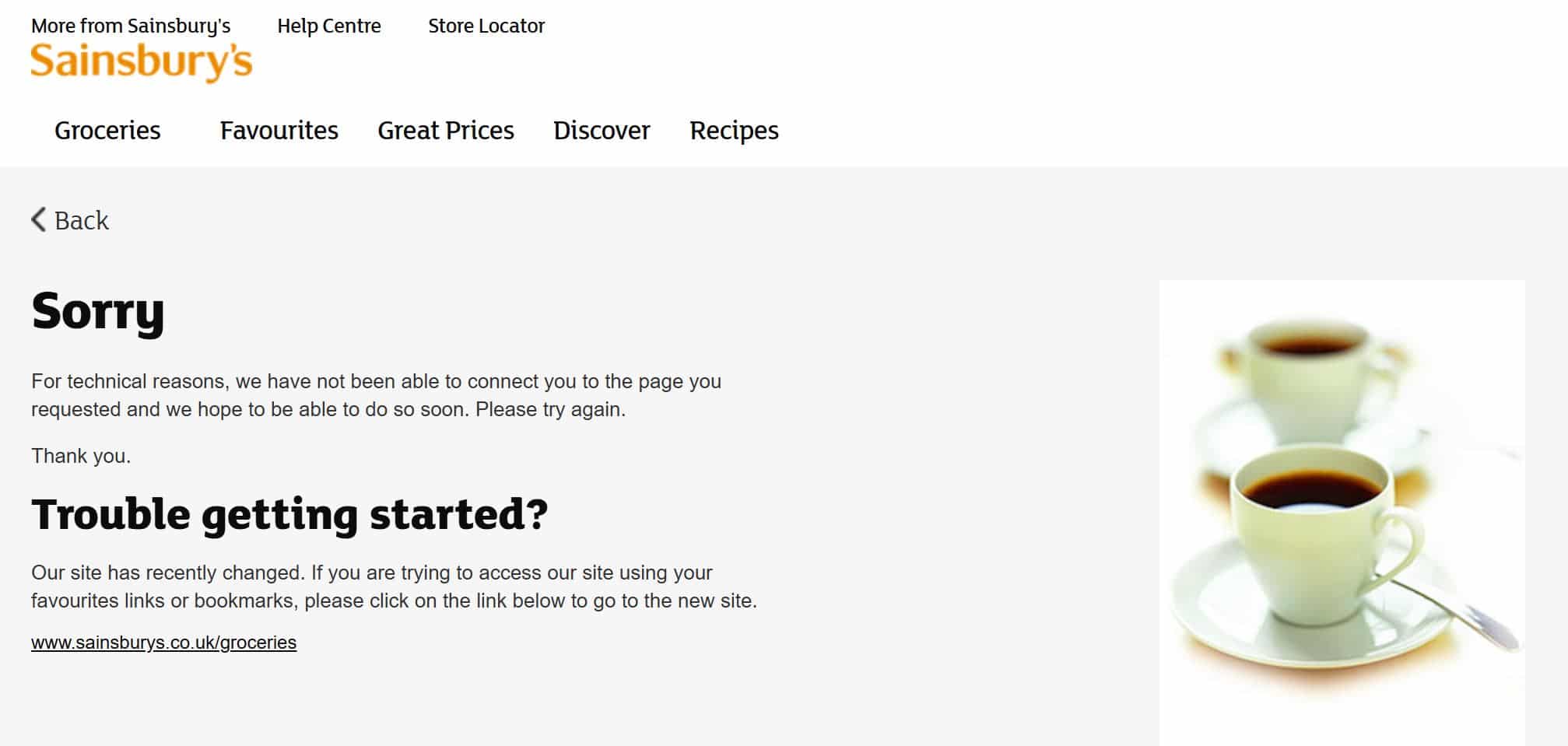
Oh Sainsbury’s… I expected so much more from you.
Like Foundry, Sainsbury’s has updated its site, meaning that there may be more 404 pages than usual. However, while the Foundry 404 page message feels friendly and conversational, this one feels clunky.
(Plus, what does a cup of tea have to do with broken pages? At least say something like ‘put your feet up and have a cup of tea while we get you back on track!’)
If a customer is frustrated that they can’t find the page they need, advising them to ‘please try again’ is probably the worst thing you can say.
Coolness: 1/5
Creativity: 1/5
Functionality: 1/5
Spoonflower
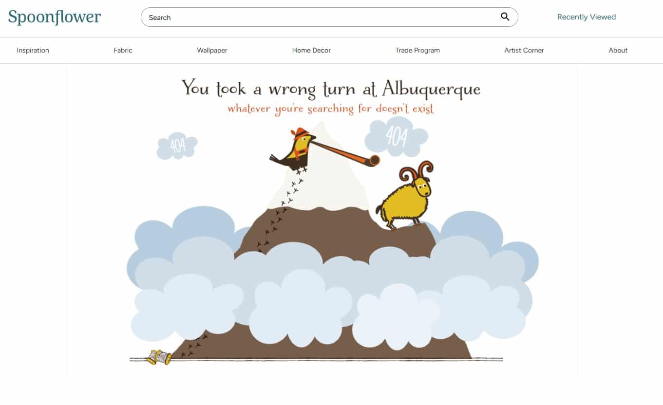
Hmm. This 404 page is a bit bizarre. It’s cute and all, but I’m not sure I get the reference. Is it an inside joke?
That being said, I do like ‘whatever you’re searching for doesn’t exist’ – it’s a bit more standout than the typical ‘whoops, the page is gone, teehee’. But the page could be more helpful in getting you back on track.
Coolness: 2/5
Creativity: 3/5
Functionality: 1/5
Stanley
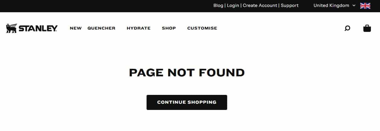
Here we have another brand that could have so much more.
The Stanley website is colourful, bright, and photo-led so it’s baffling that it doesn’t extend this to its 404 page.
Coolness: 1/5
Creativity: 2/5
Functionality: 2/5
Star Wars
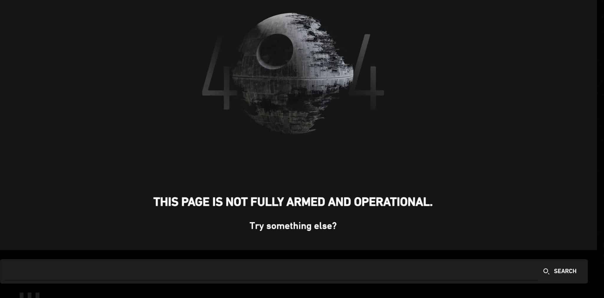
I was expecting good things from the Star Wars 404 page and it definitely delivered.
The Death Star as the ‘0’ in ‘404?’ Perfect. The ‘this page is not fully armed and operational?’ To say I geeked out was an understatement.
Star Wars definitely understands its brand, and I love how it applies it to the error pages on its site.
Coolness: 5/5
Creativity: 5/5
Functionality: 3/5
The Academy Awards
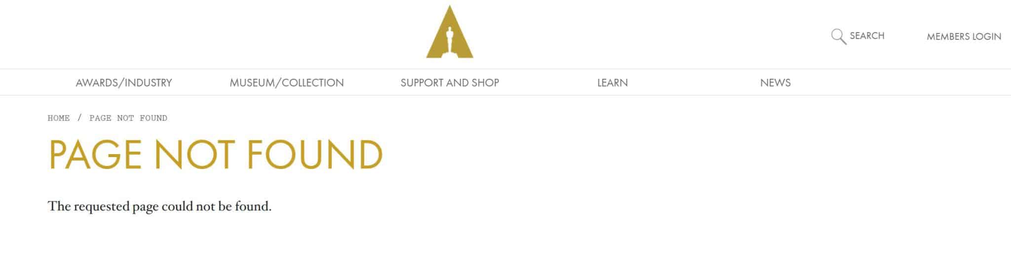
I know the Academy Awards is meant to be high-brow and refined, but I feel they could have done a lot more with this.
I like how the heading is the Academy Awards golden-yellow, but that’s about as far as my enjoyment of this 404 page goes.
A link to popular pages would have gone down well here, or even interesting facts about the Oscars would have been cool.
Your 404 page is valuable real estate on your website – don’t ignore it or do the bare minimum with it.
Coolness: 1/5
Creativity: 1/5
Functionality: 1/5
The Body Shop
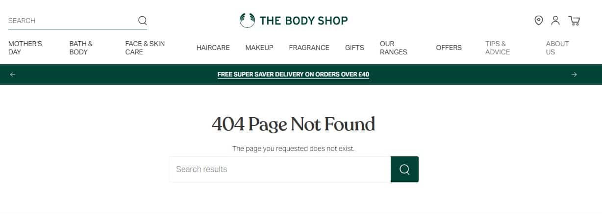
Here we have another 404 page which is alright, but not show-stopping.
It’s well-branded and I like that there’s a search bar, but it feels like it could be so much more, especially after seeing cool 404 pages from beauty brands like Drunk Elephant.
Coolness: 2/5
Creativity: 1/5
Functionality: 3/5
Threadheads
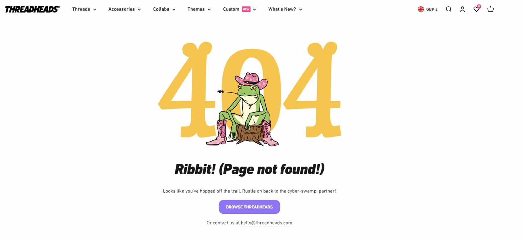
This 404 page is right on brand for Threadheads. It’s bright, cute, funny, and best of all it’s consistent – the copy marries up with the image.
I like how there’s an email address too – it provides customers with an extra way to report a broken link or ask for help.
Coolness: 4/5
Creativity: 3/5
Functionality: 3/5
Transport for London
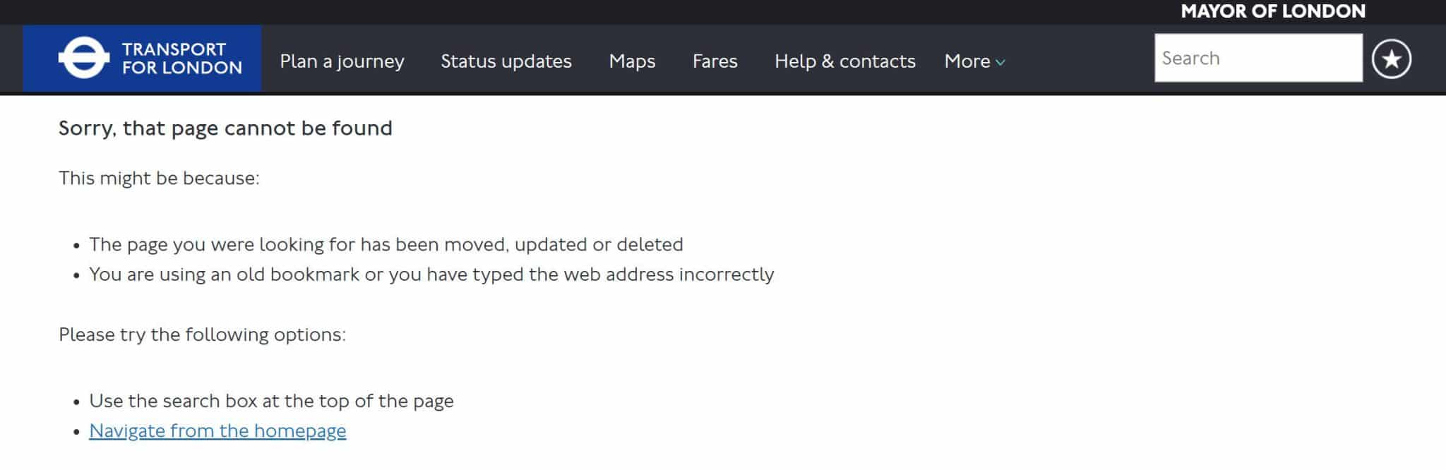
This page won’t be winning any design awards, but I like it because it’s thorough. It details why the visitor has landed on a 404 page and how they can get back on track.
Plus, bland as it may be, this page will work well on mobile, which is vital considering that most of its users will be searching for information as they’re bouncing around on the bus and tube.
Coolness: 1/5
Creativity: 1/5
Functionality: 4/5
University of Cambridge
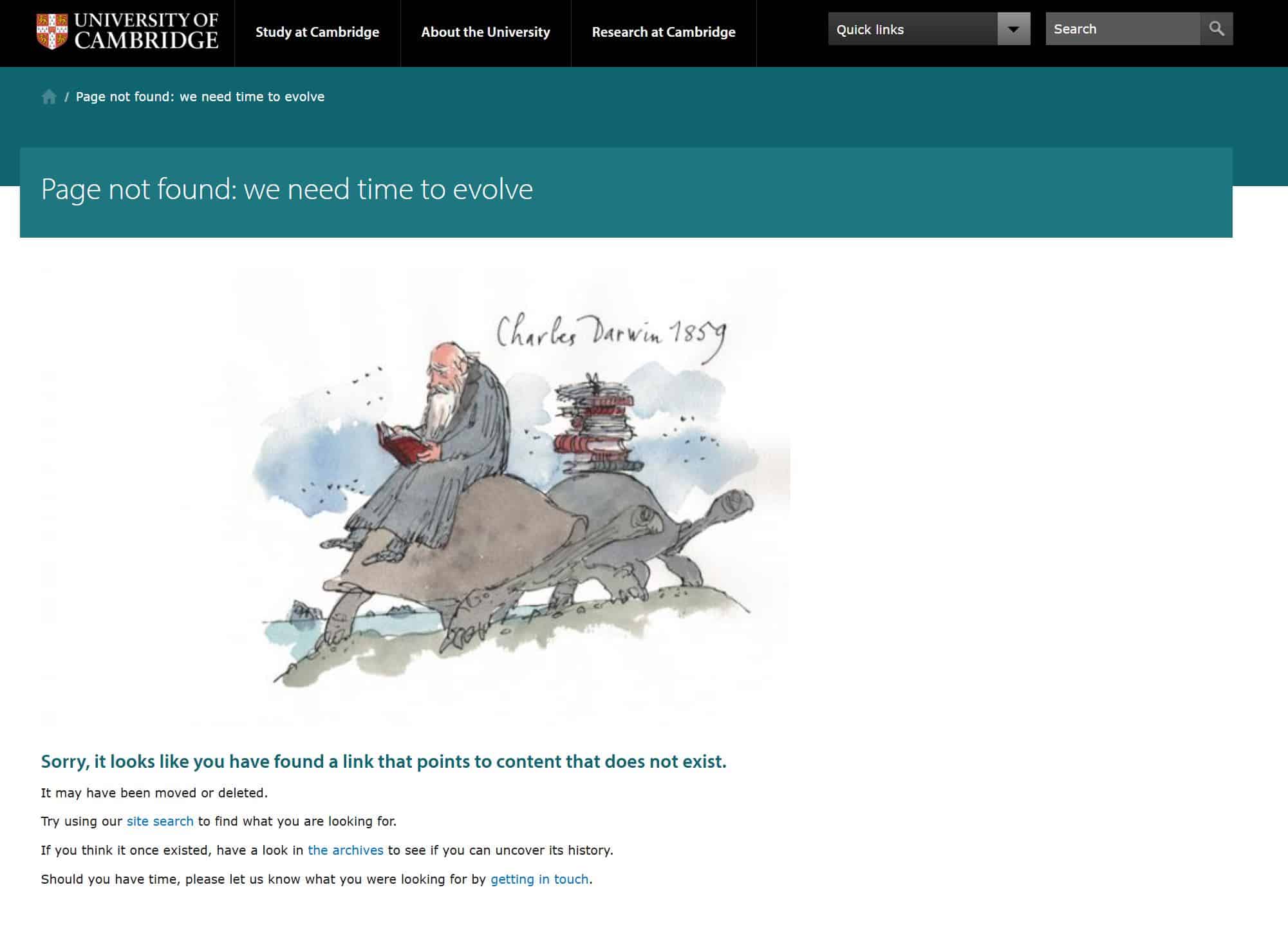
You wouldn’t think that an academical institution would have a quirky 404 page, but the University of Cambridge left me pleasantly surprised.
There’s a funny tagline ‘we need time to evolve’, alongside a cartoon of Charles Darwin, and useful links to help the visitor get back on track. The copy is a little formal, but I’ll give that a pass because it’s for a university, and it’s only natural that the wording is going to be more traditional.
Coolness: 3/5
Creativity: 4/5
Functionality: 3/5
University of Oxford
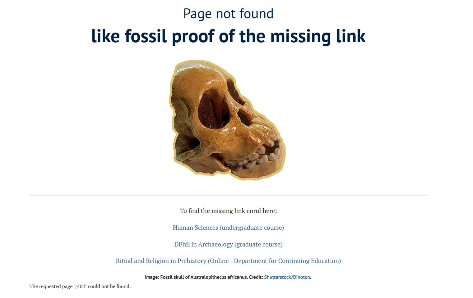
The 404 page for the University of Cambridge got me thinking: what do other university 404 pages look like? So I decided to take a look at Cambridge’s long-standing rival, the University of Oxford.
I really like this – like Cambridge, Oxford has made a pun about a missing page, but has taken it one step further. Plus, I like how the university is using the page to promote its relevant courses.
And the great thing is, the page changes when you refresh it! Here’s another variant:
Coolness: 4/5
Creativity: 5/5
Functionality: 3/5
Urban Outfitters
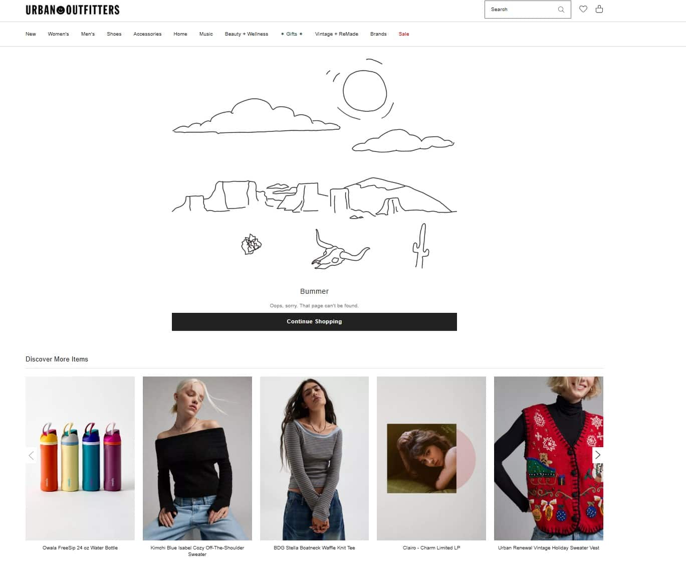
Is this page a bit random? Yes. Does it work? Absolutely.
I love the ‘Bummer’ message and the desert landscape – it’s on trend for a quirky and irreverent brand. Plus, there are links to products the visitor might find of interest, which is a smart thing to do if you run an eCommerce store.
Coolness: 5/5
Creativity: 2/5
Functionality: 3/5
Vodafone
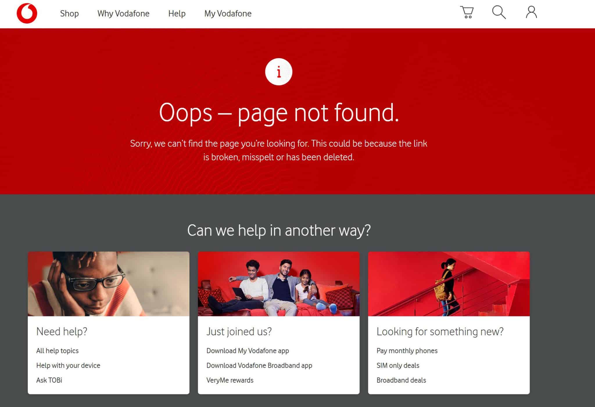
By this point in the article, you know that I love a weird and wonderful 404 page full of surprises. In this respect, the Vodafone 404 page is pretty basic.
However, the wording is friendly, the page is on brand, and best of all, there are plenty of navigation links to help visitors get back on track. So it’s a thumbs up from me.
Coolness: 2/5
Creativity: 3/5
Functionality: 5/5
Waterstones
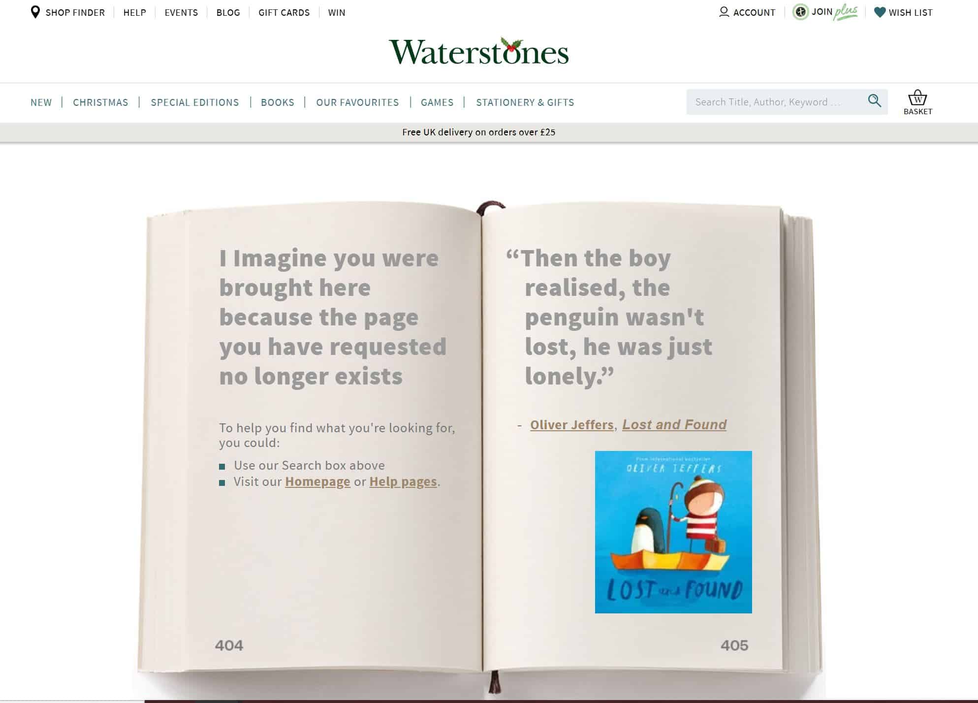
Another business that understands its brand and its customers, Waterstones has got its 404 page nailed down.
I love the fact that it’s a book, I love the fact that the page number is 404, and I love the fact that it’s got a relevant book quote on the other page.
The absolute cherry on the cake would be if the book quote changed every time you refreshed the page (trust me, I checked) but that’s just me being greedy.
Coolness: 4/5
Creativity: 5/5
Functionality: 3/5
Wembley
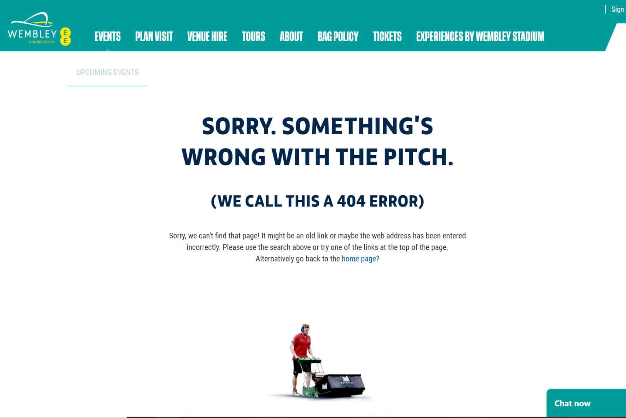
I like this 404 page as it’s right on brand for Wembley – the football terminology, the man mowing the pitch… it all comes together really well.
The clear explanation is also good – the page explains what a 404 error is, why the error might have happened, and how the visitor can find what they need.
Functionality and a dash of humour, what’s not to like?
Coolness: 4/5
Creativity: 3/5
Functionality: 3/5
Wild
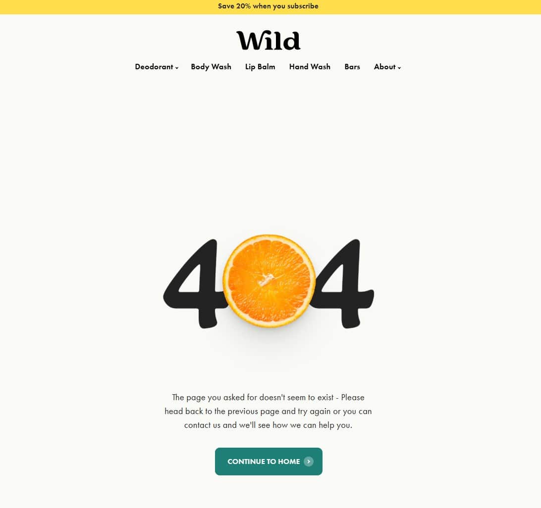
This 404 page looks okay on the surface, but something about it bugs me.
The image with the zesty orange is good, and the copy is helpful, if not running on too long. But the thing that irks me is that it says ‘contact us and we’ll see how we can help you’ – but it doesn’t say how.
If you want to encourage people to get in touch with broken links, include an email address or a link to your contact us form. Don’t assume page visitors will work out how to do it themselves.
Coolness: 2/5
Creativity: 3/5
Functionality: 2/5
404 page FAQ
What is a 404 page?
How do you create a good one?
And are 404 pages any good for SEO?
You’ll find all the answers here!
What is a 404 page?
A 404 page is an error page that tells visitors that a certain web page is not available.
For example, if they try to access a page that no longer exists or if they type an URL into their browser incorrectly.
Why do websites use 404 pages?
404 pages tell visitors that a page doesn’t exist. So for example, if they type in a URL incorrectly, they know to check the URL they entered for typos.
Another reason why websites use 404 pages is to provide visitors with resources so they can find the information they need. Like links to popular pages or a search bar.
What’s the difference between a redirect and a 404 page?
A redirected page automatically takes visitors to another relevant page.
Let’s say you deleted page A, but page B has all the information a visitor needs to know – you can redirect anyone trying to access page A to page B instead.
Think of a page redirect like a diversion, while a 404 page is like a stop sign!
The thing with redirects is that you need to redirect a visitor to a page that offers similar value to the page they expected to visit. If not, they may get confused or annoyed.
In this situation, a 404 page is the better option.
Are 404 pages bad for SEO?
404 pages aren’t necessarily bad for SEO. The issue comes when a 404 page is badly designed or doesn’t tell visitors what to do next.
This can lead to a poor user experience, which in turn can tell the search engines that your site isn’t a trustworthy or relevant one.
What are the best SEO practices for setting up a 404 page?
- Provide links to important areas of your site
- Include a search bar so visitors can find what they need
- Offer contact information if visitors have a question
- Track broken links so you can fix or redirect them as appropriate
Want to work with a digital marketing copywriting expert?
Before I became a copywriter, I was a digital marketing manager with plenty of experience of broken links and 404 pages!
Whether you’re a digital marketing agency looking to blog for the first time, or a SaaS platform wanting to refresh its web pages, we should talk.
Just hit the button below to find out more about the services I offer and how I can help promote your business